


Cartoon Network Brand Evolution
Brand identity evolution for a multi-genre, multi-platform network
Featured in Adweek: “Cartoon Network Shows Off Brand Refresh for 30th Anniversary.”
Role & Scope
Network-side Creative Direction
Partnered closely with Buck, guiding brand system alignment across motion, visual language, and platform applications.
Team: In-house Cartoon Network team + Buck
Cartoon Network was evolving into an umbrella brand, supporting kids and young adults content across animation, live action, and blockbuster franchises within Warner Bros. The existing identity, while iconic, was no longer flexible enough to scale across genres, platforms, or audiences.
With the shift to HBO Max, the brand was reimagined as a design-forward, modular system rooted in CN’s original DNA. By elevating the checkerboard logic, geometric structure, and CMYK foundation, the identity gained the clarity and sophistication needed to sit alongside franchises like Harry Potter, DC, and Wonder Woman—without losing the playful energy fans associated with Cartoon Network.
The result was a future-facing brand system that unified legacy animation and premium storytelling under a single visual language, allowing Cartoon Network to expand its audience, modernize its perception, and confidently operate as a global entertainment brand.
Keeping the Foundation Strong
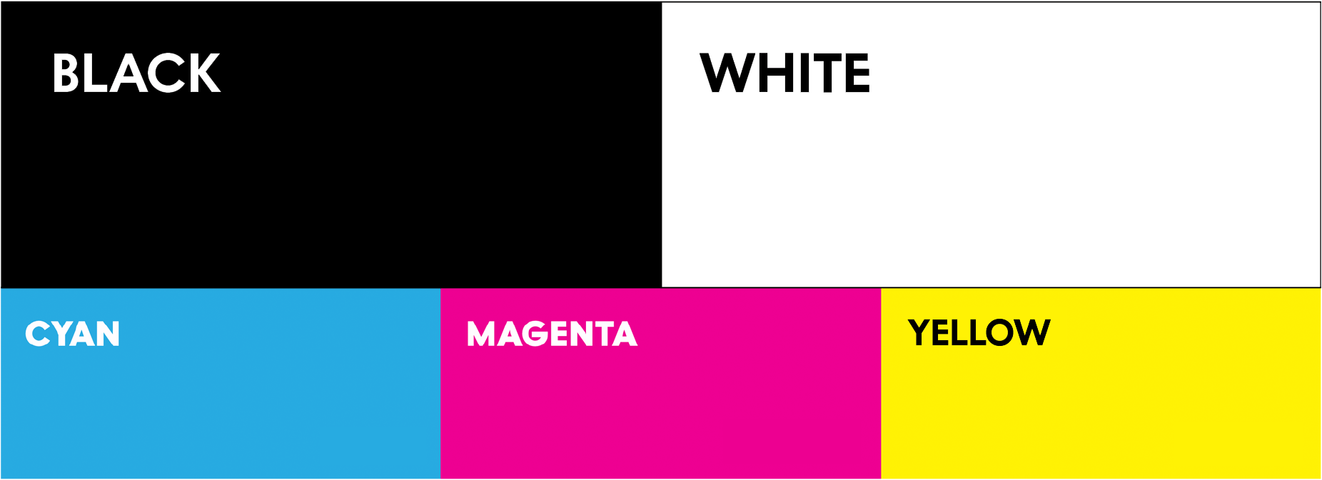
To get there, we went back to the foundation. CN has always been graphic, bold, and rooted in design. The checkerboard logo, the CN mark, and the original CMYK palette all carried deep equity, so our evolution began by pulling from the geometry already embedded in the brand.

The “C” as a circle and the “N” within a square became the structural backbone of the system, defining layouts, transitions, and motion in a way that felt new but authentically CN.
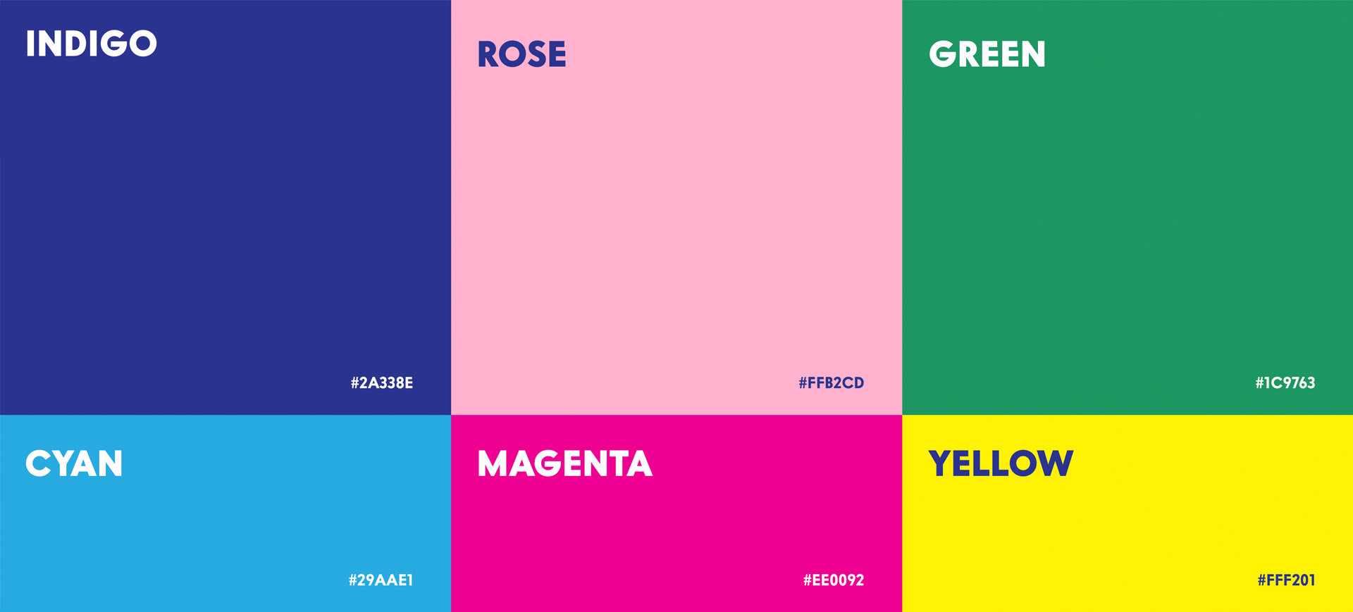
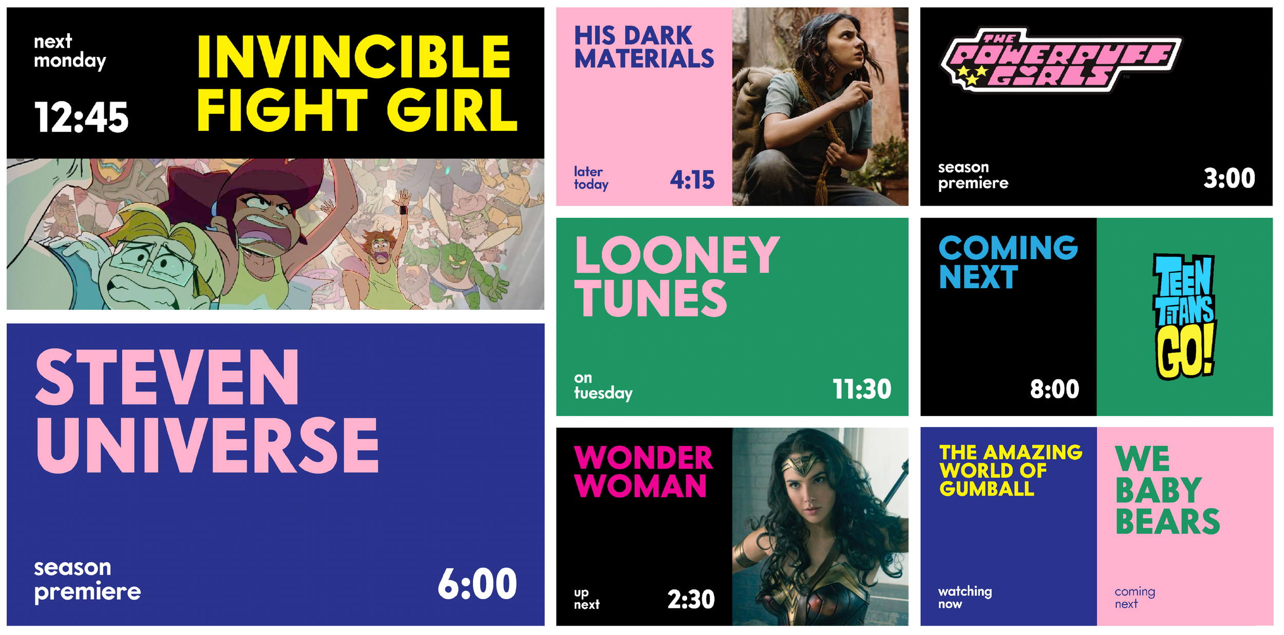
Extended Color System
The color palette was extended from the brand’s CMYK core, blending and evolving tones to support a much broader range of content. The new colors gave us the depth and drama needed for action and fantasy franchises, while still tying back to the brand’s history. CMYK remained in the system, but became secondary—used where it made the most sense for legacy content and lighter tonal moments.
Typography
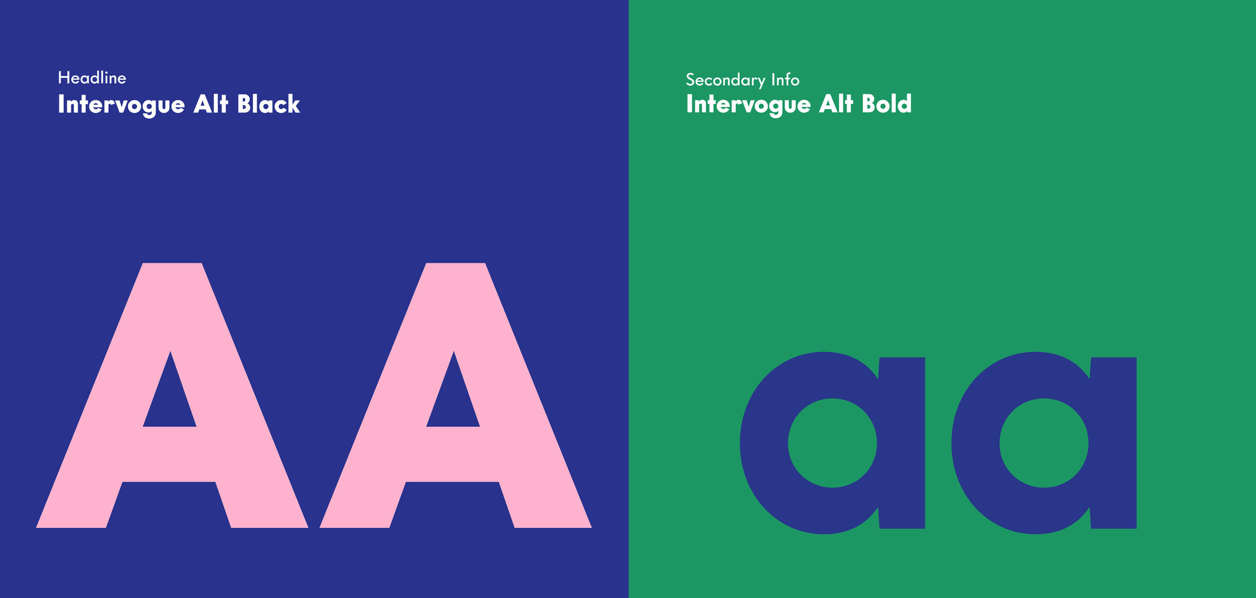
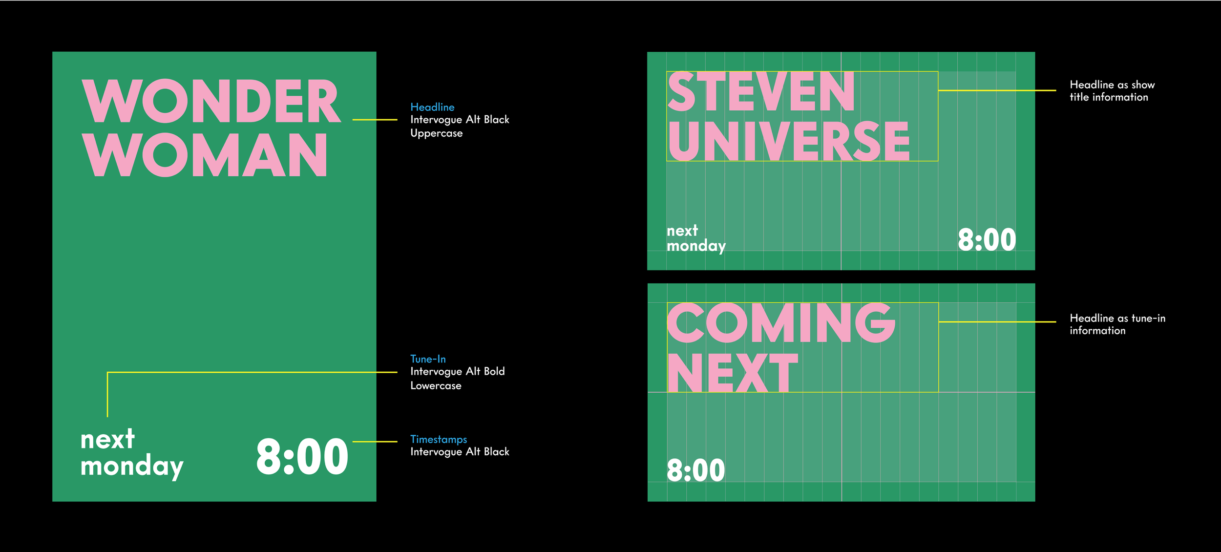
Our typography needed to work across genres, from comedy to action, while feeling modern, sophisticated. Intervogue Alt Black and Intervogue Alt Bold gave us the flexibility to build a clean, design-forward hierarchy that scaled from tune-in messaging to cinematic key art.
The Grid In Motion
Brand And Logo Stingers
The brand stingers became one of the most effective ways to express how wide the Cartoon Network universe had become. We turned the screen into a two-square content grid, mirroring the structure of the CN logo, and let characters from entirely different worlds interact across the divide. A basketball tossed by the bears from We Bare Bears could bounce seamlessly into Wonder Woman’s arm cuff. Harry Potter might cast a spell that sent Steven Universe into a puff of smoke. Batman could leap upward as a character from Summer Camp Island unfurled its wings in response.
These moments were quick, playful, and felt exactly like CN, but they were also calibrated to feel polished and sophisticated enough to sit beside blockbuster IP. The stingers allowed us to blend genres, eras, and tones into a single expression of the brand, signaling that all of this content — animation, action, fantasy, and live action — now lived together under Cartoon Network’s expanded umbrella.
As we expanded the identity, we created an internal exploration that brought the CN logo to life through custom illustration. Built from the same geometric logic as the system, it showed how the identity could flex playfully inside the mark, integrating character, motion, and brand structure to extend the toolkit beyond the core package.
End Cards
These interactions resolved into end cards that anchored every promo and trailer with a clear brand sign-off.
Built from the same two-square logic, the end cards provided a consistent, flexible framework for motion, timing, and hierarchy across the network. Subtle graphic “bits” added energy and rhythm without overwhelming content, allowing the system to scale seamlessly from playful comedy to cinematic storytelling.
Wipes / Squeeze Credits / Lower Thirds
Wipes, squeeze credits, and lower thirds extended the system into everyday on-air moments. Rooted in the same grid and geometric principles, they applied the identity consistently across functional elements without introducing new logic. Overlapping color fields demonstrated how the expanded palette grew from the original CMYK core, allowing the system to scale naturally while remaining cohesive and distinctly CN.
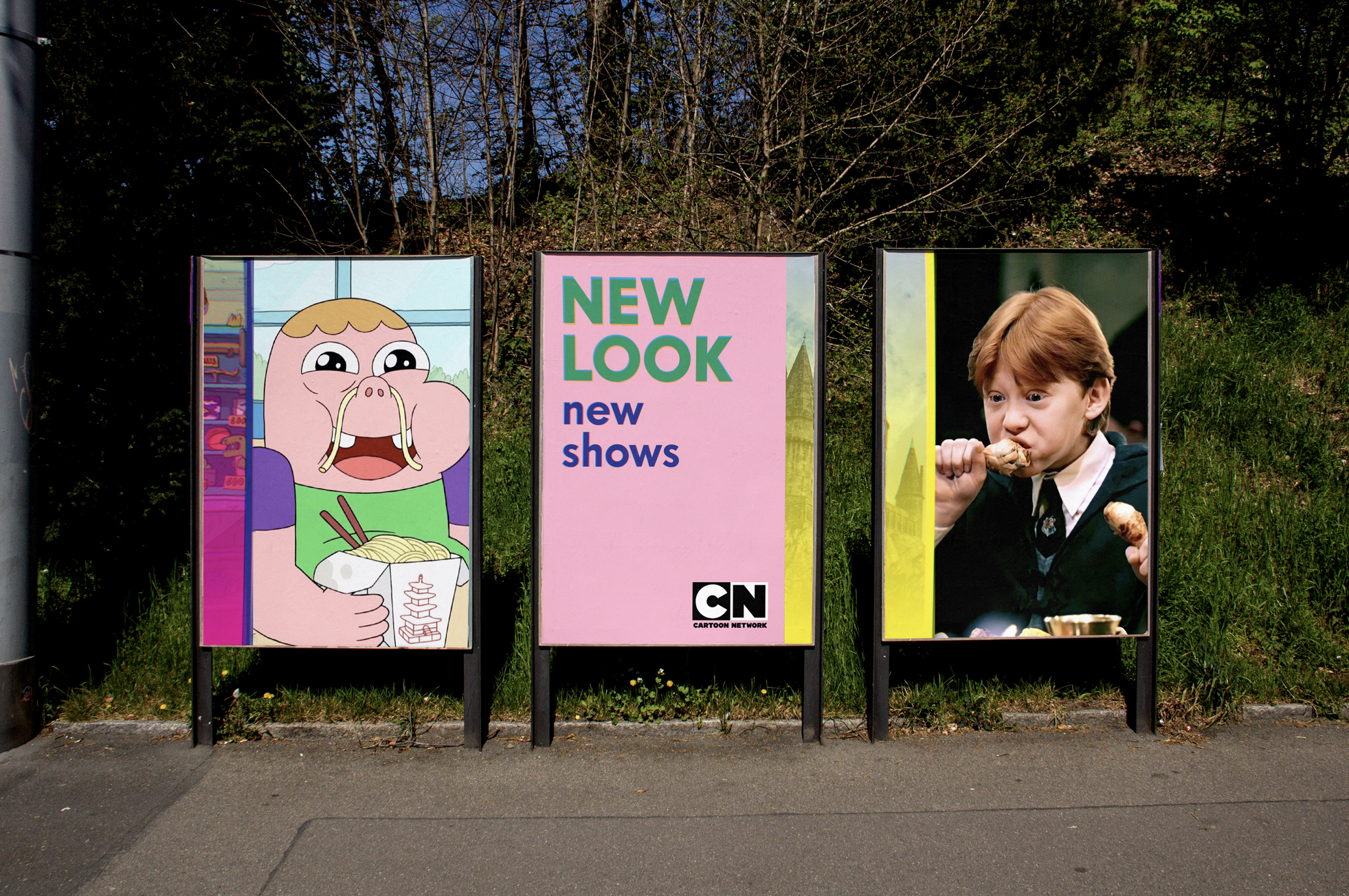
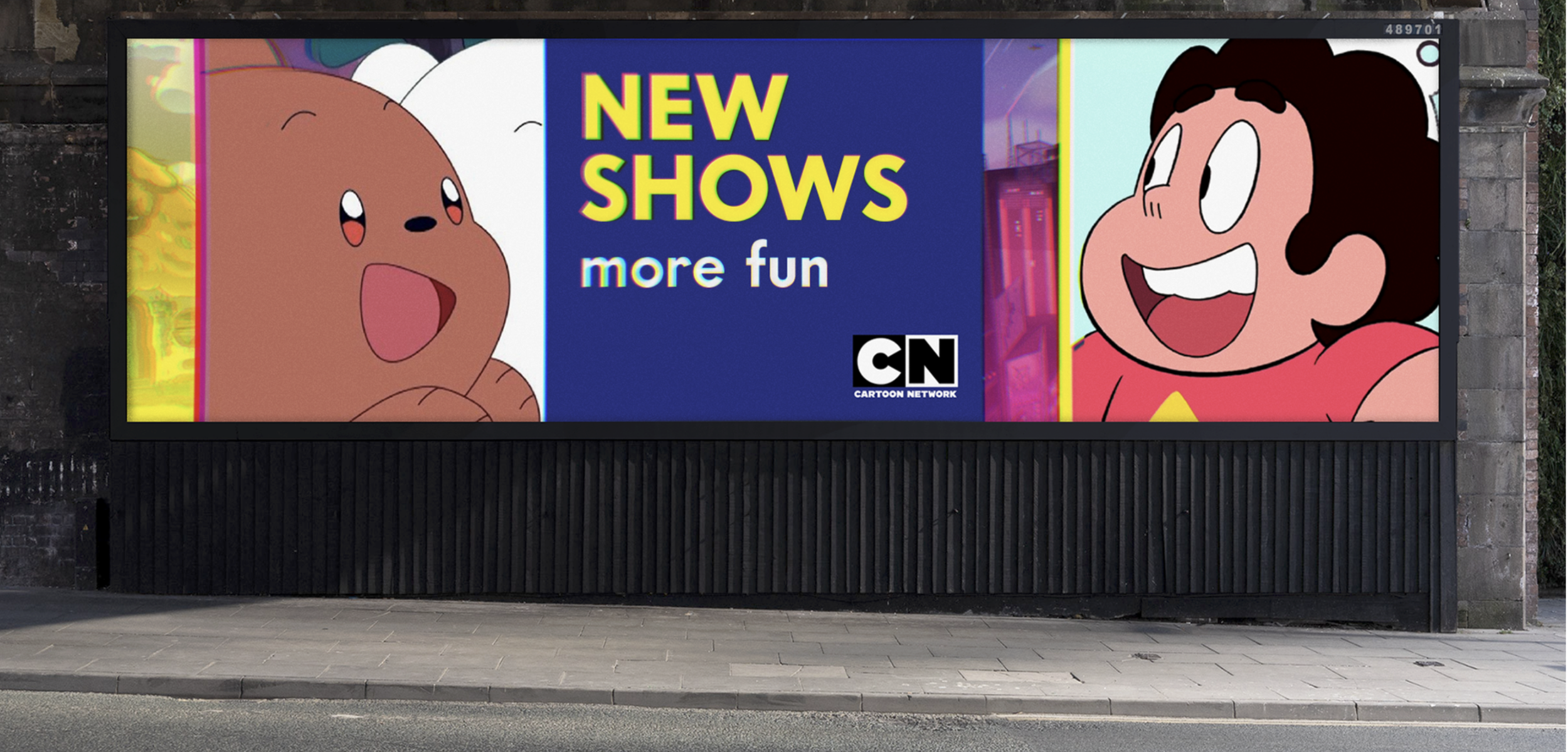
Print extended the on-air system by translating motion into static form. Using the same grid and panel structure, layouts were composed to feel like captured moments from the motion package, preserving a sense of kinetic energy without animation. Implied movement through composition, scale, and color allowed the identity to carry the energy of the screen into physical space, creating a cohesive and intentional extension of the system across print and OOH.

We partnered with Buck to bring the visual system to life, and collaborated with Antfood to develop a cohesive sonic package for the brand. On the brand side, I led the creative direction—defining the brief, shaping the system logic, aligning across leadership, and guiding the work to ensure it stayed true to CN’s design DNA. Together, we built an identity that was modern, modular, and future-proof, designed to grow with the network and adapt as its content expanded.
The result was a meaningful evolution for Cartoon Network—one that honored its legacy, expanded its reach, and created a flexible visual language for a new era.
Credits
Network Creative Direction: Candice House
Brand Partner: Buck
Sound Design: Antfood
Cartoon Network: In-house Brand & Marketing Team