

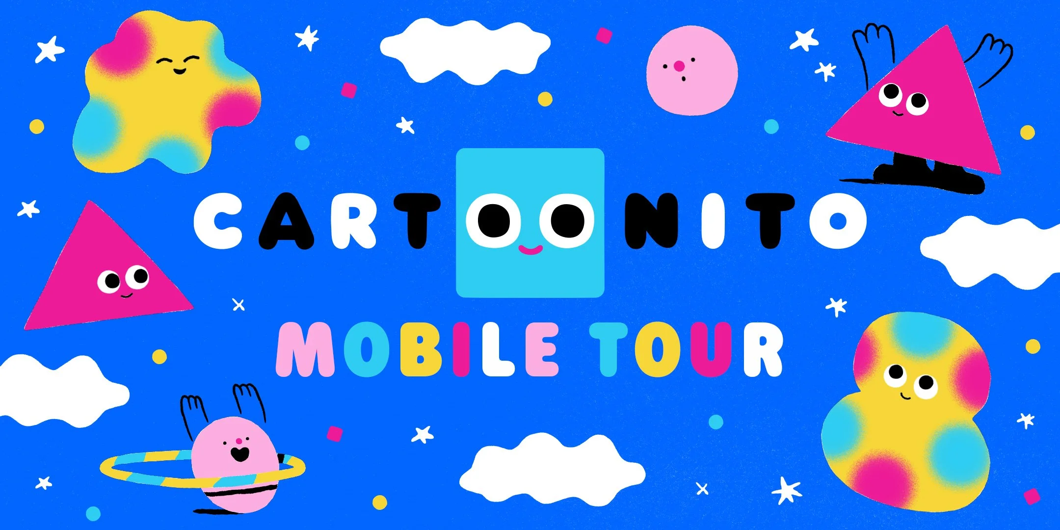
Cartoonito
A modern preschool brand built from simple shapes, thoughtful design, and humancentric learning.
Role & Scope
Network Creative Direction & Brand System Leadership
Served as the network-side Creative Director for Cartoonito, defining the brand’s visual identity, tone, and system across on-air, digital, and experiential touchpoints. Designed the Cartoonito logo and created three of the four core character designs, developed alongside the VP of Creative and internal team.
Led creative direction in close collaboration with my Art Director, overseeing the brand system and managing internal design team output across packaging, promos, and lower thirds. Curated and guided all externally produced animated shorts, selecting creative partners and concepts, and providing creative guidance and final approvals to ensure alignment with the broader brand system. Animated shorts were produced by Buck and Giant Ant.
Internal character bump animation was directed by Adult Swim’s animation leadership, with final creative review and approvals handled at the network level.
Team: Cartoon Network internal design and animation teams, Giant Ant, Buck
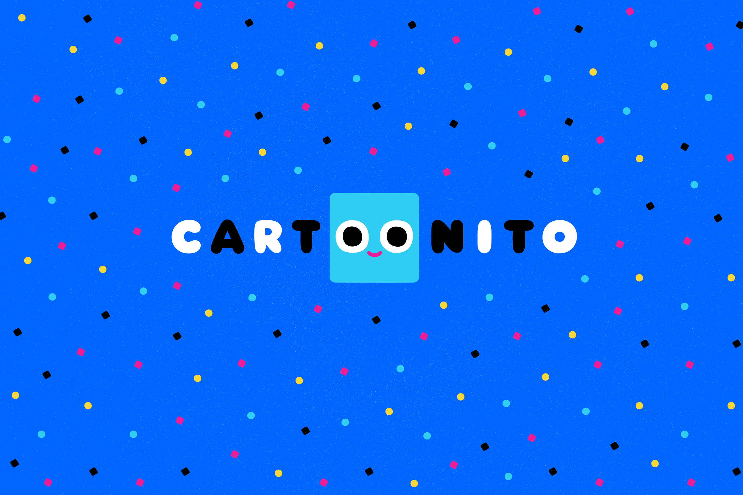
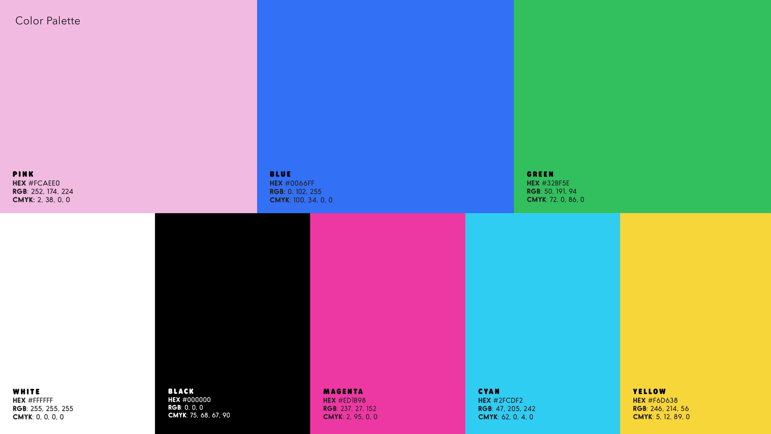
Cartoonito was developed as a global preschool brand rooted in the belief that young audiences are more visually sophisticated than they’re often given credit for. The identity was designed to feel warm and playful while remaining graphic, considered, and design-forward, with subtle references to Cartoon Network’s color palette, geometry, and checkerboard DNA to ensure continuity within the larger brand ecosystem.
Brand Identity System
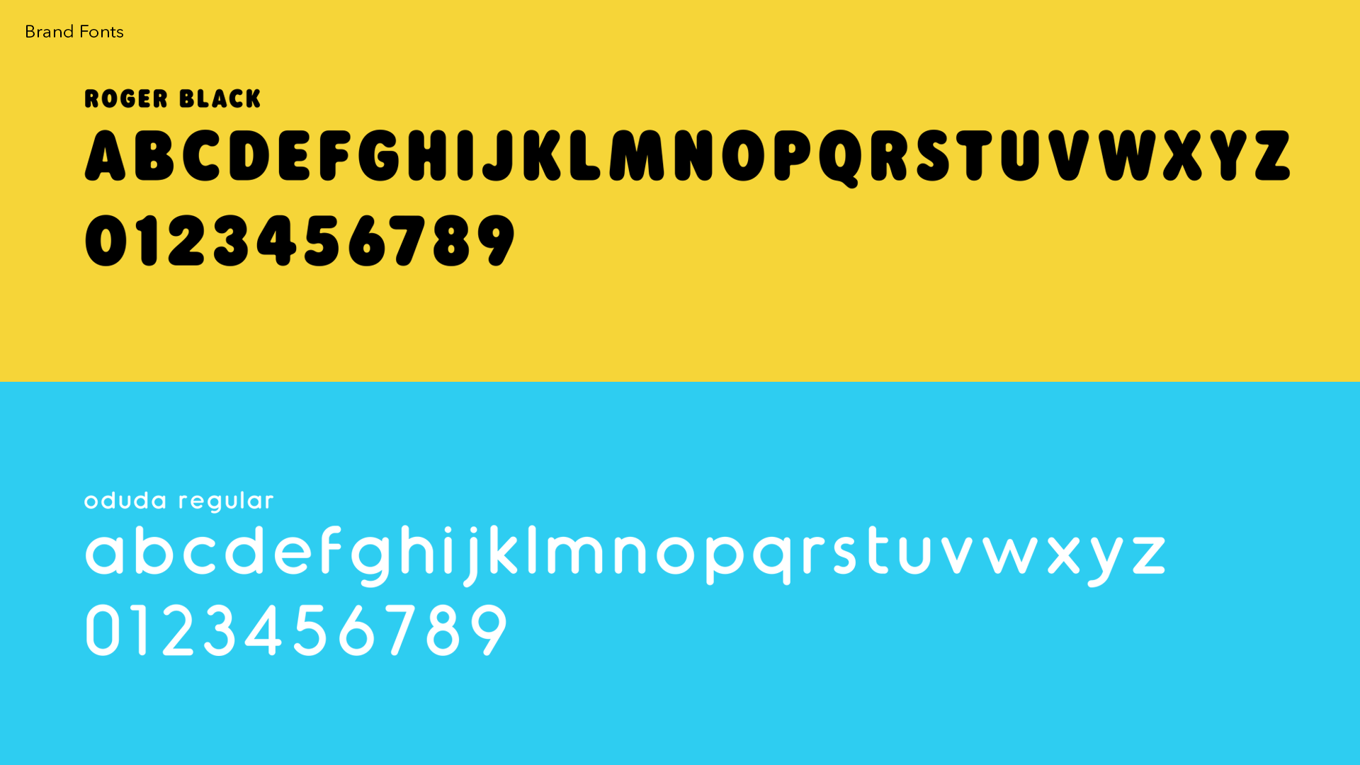
The Cartoonito brand system was built from simple, modular shapes, designed to flex across logos, characters, icons, and motion while remaining warm and approachable. Roger Black was chosen for its rounded forms and friendly proportions, subtly referencing Cartoon Network’s typographic DNA while softening it for a preschool audience and holding up clearly in motion and at small sizes.
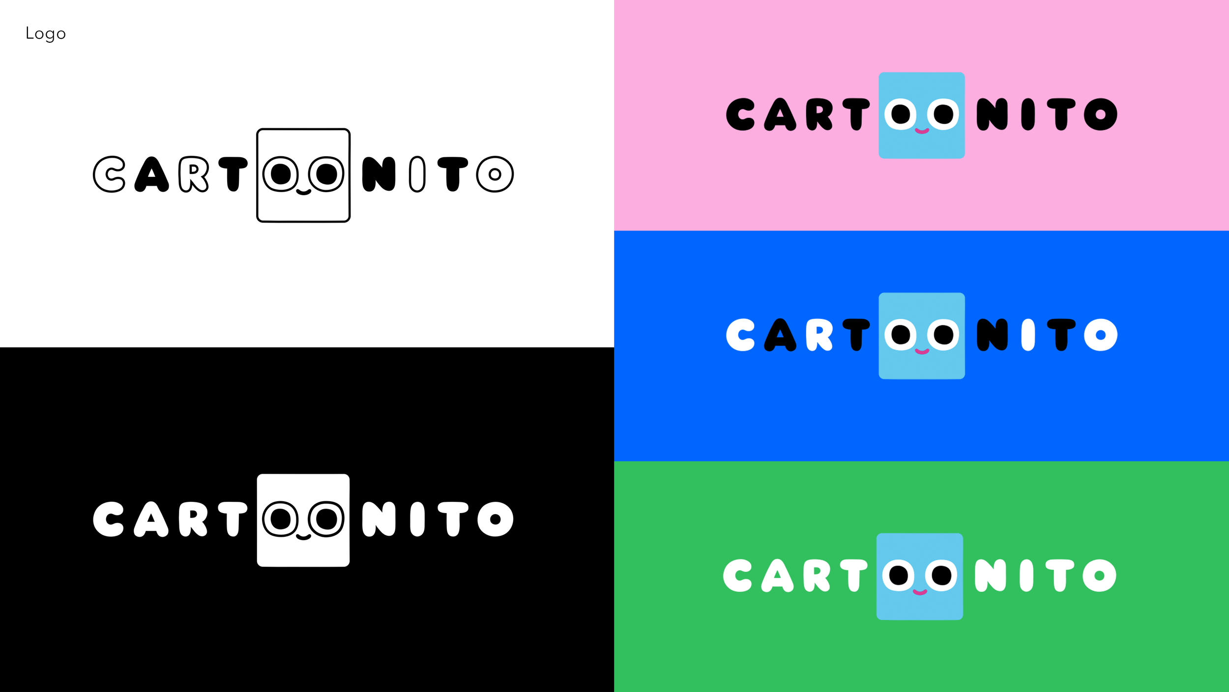
The Cartoonito logo lettering was custom-drawn to further humanize the mark and ensure it felt native to the system rather than applied. Elements of Cartoon Network’s color palette, geometry, and checkerboard rhythm were woven in to create continuity without direct quotation.
The logo integrates Nito’s eyes as the two “O”s, creating a mark that feels alive and able to interact directly with viewers.
Naming & Identity Exploration
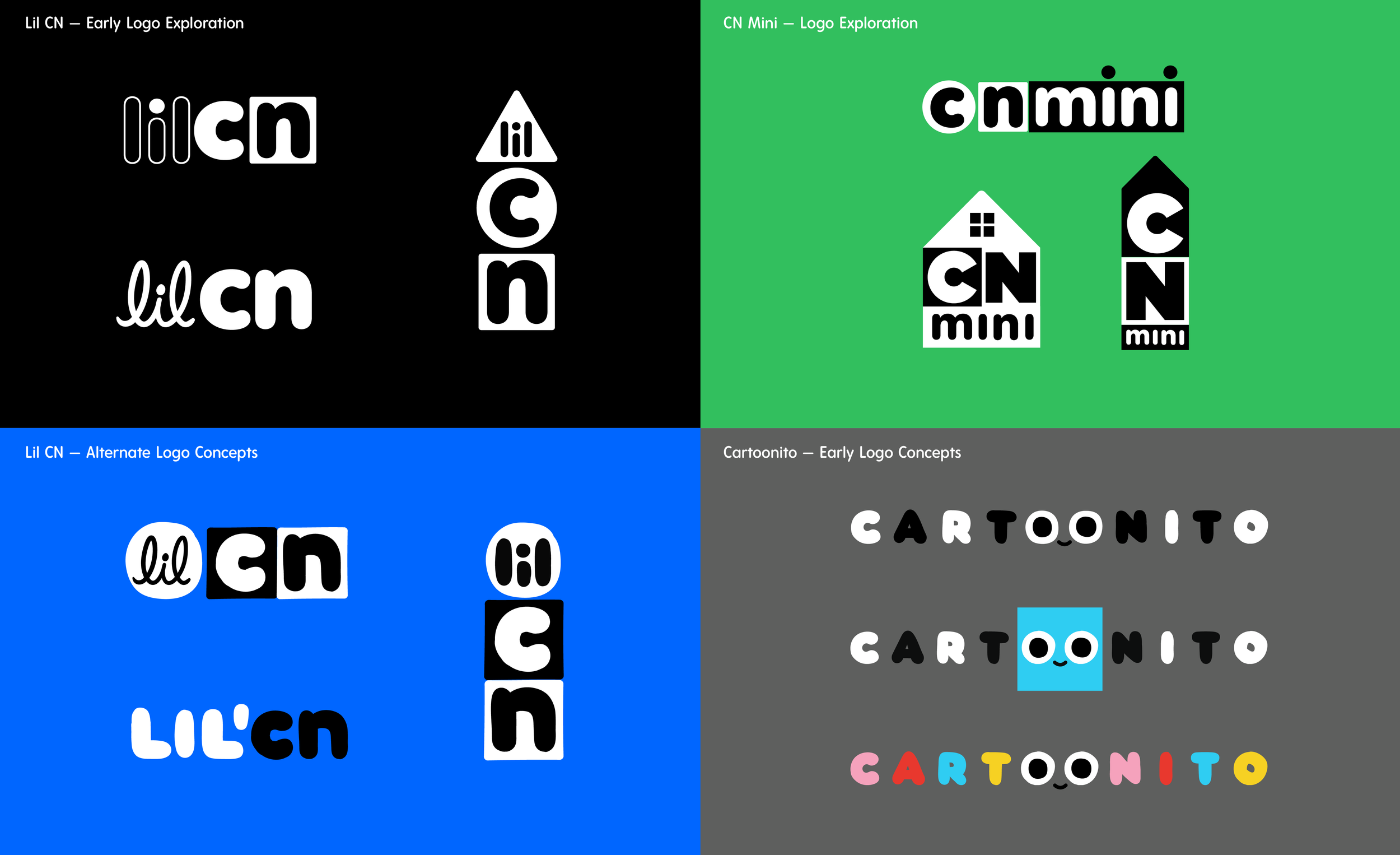
Logo Exploration & Development
Before landing on Cartoonito, we explored multiple naming and identity territories — from Lil CN to CN Mini — testing how far we could push preschool simplicity within the Cartoon Network design language.
We began by exploring how simple geometric shapes—familiar to toddlers—could evolve into expressive characters and modular building blocks for imaginative play. These sketches helped establish a shape-driven emotional language that would scale across animation, education, and interstitial moments.
Early Character Design Exploration
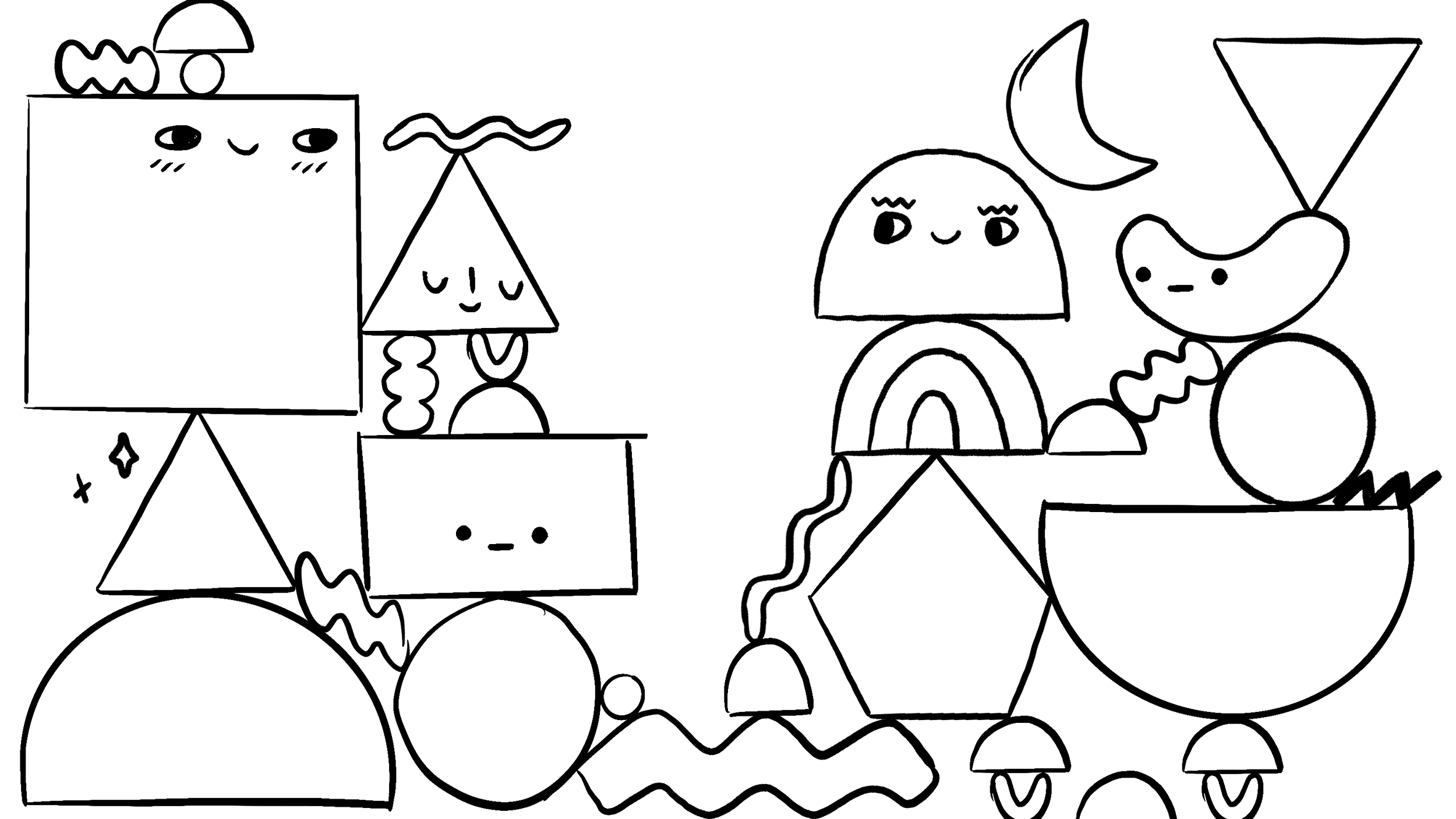
Early Shape Combinations — Line Explorations
Testing Personality Through Simple Forms
Imaginative Worlds With Shape-Based Characters
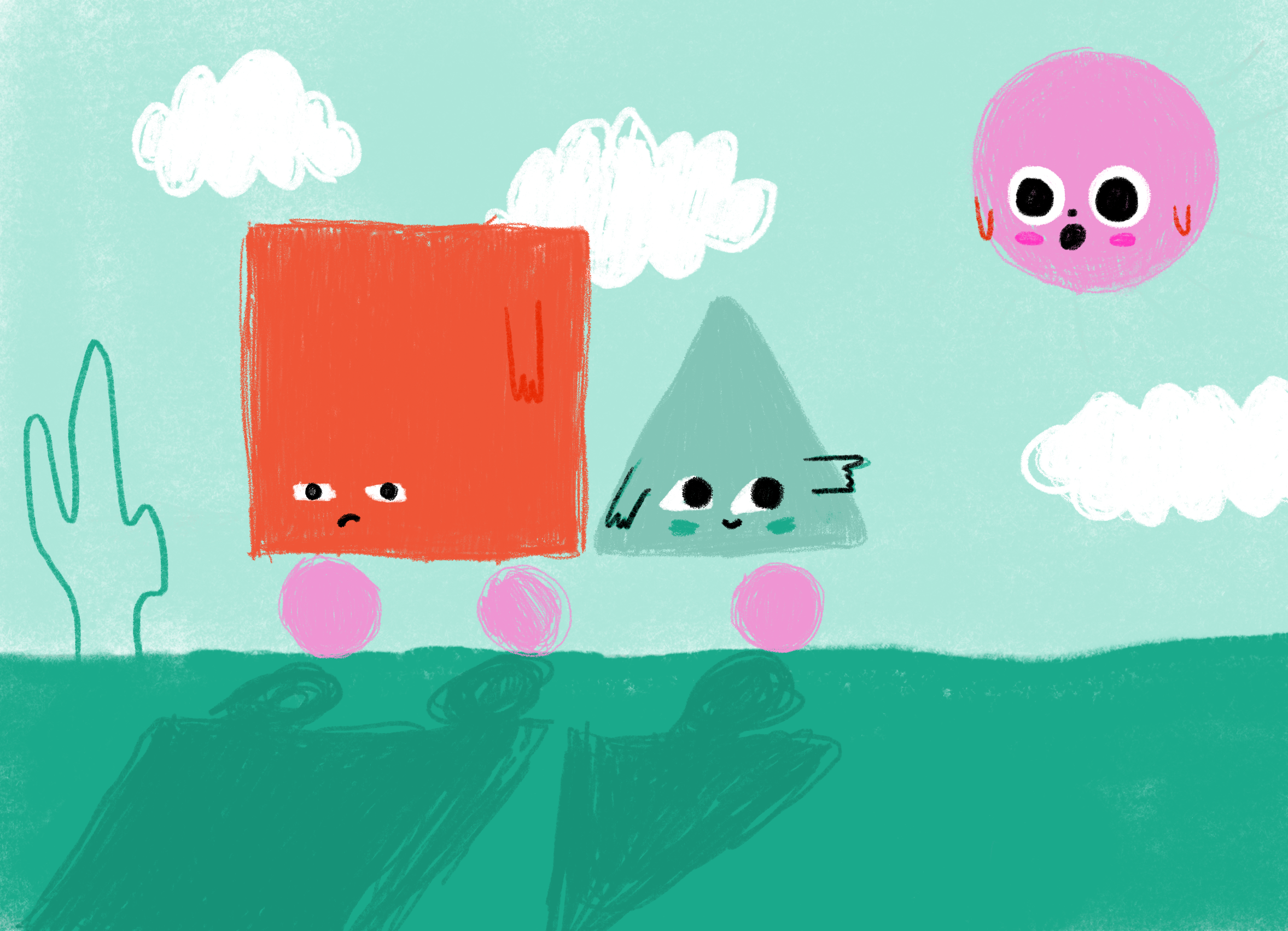
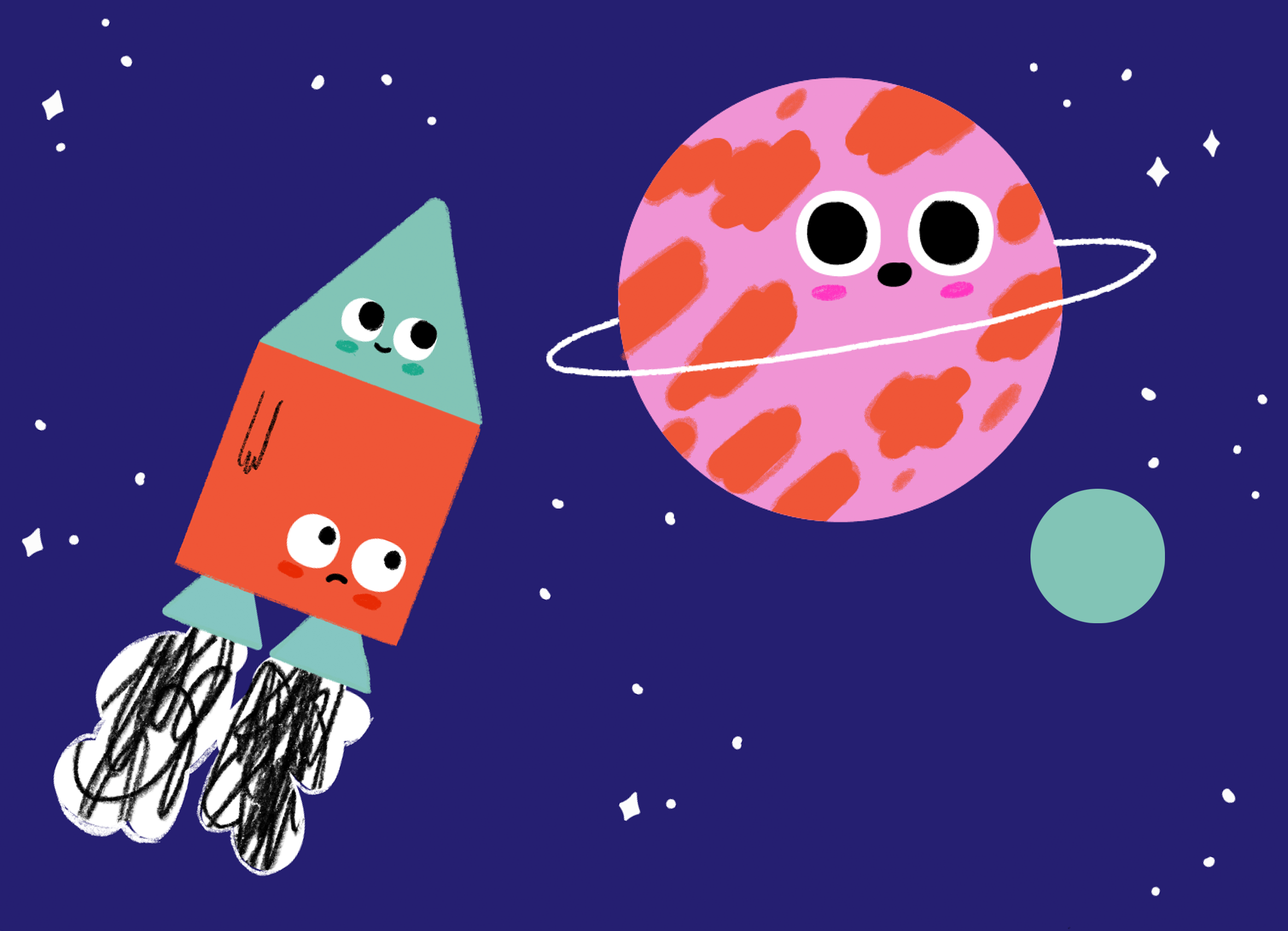
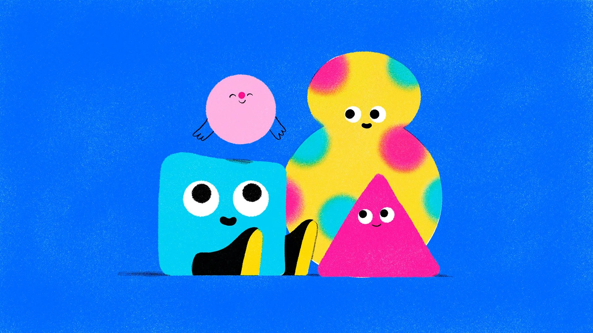
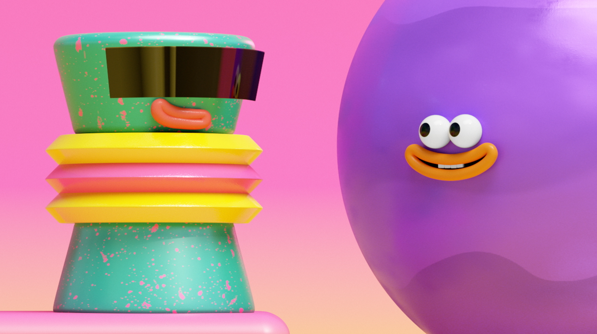
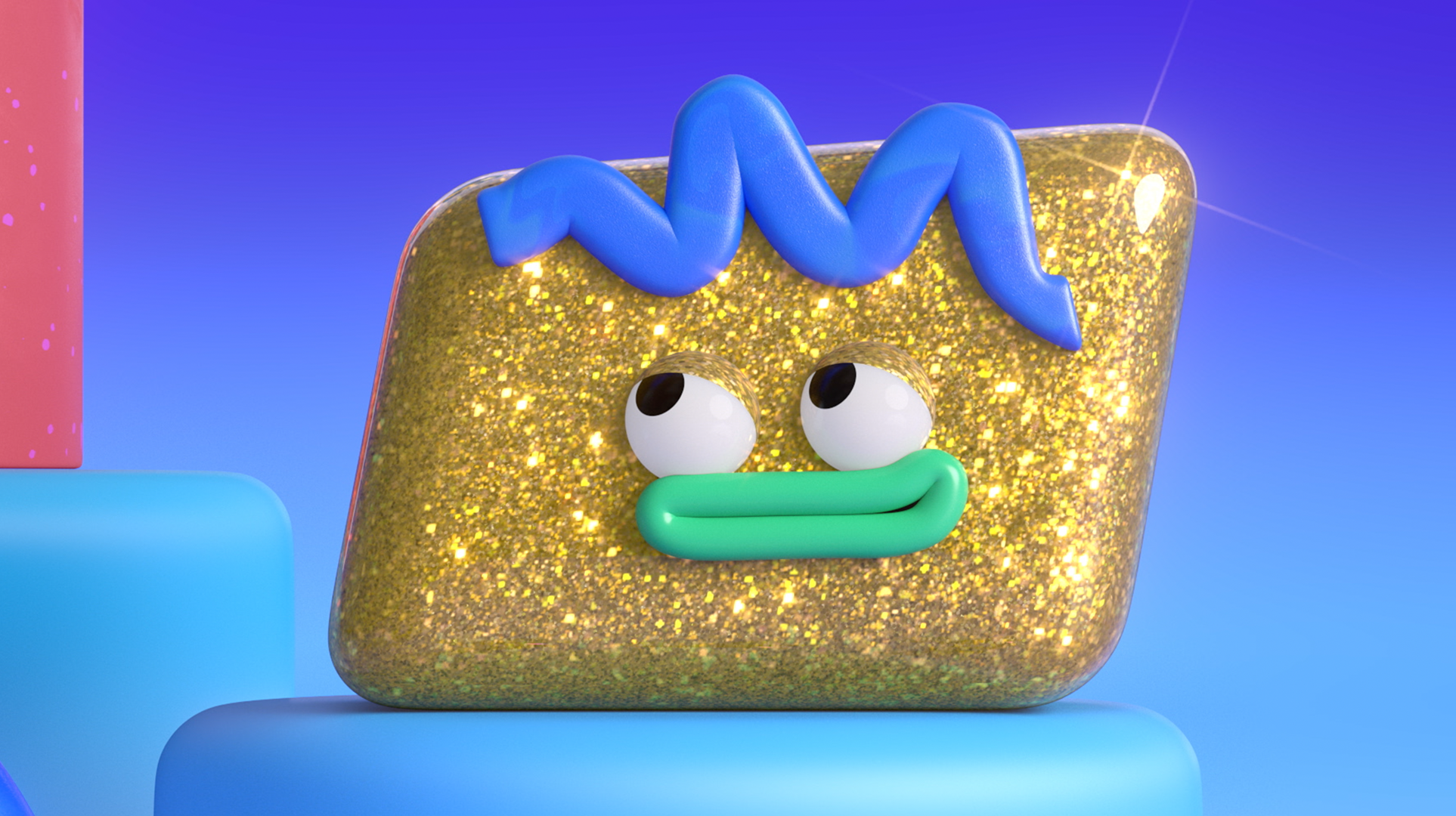
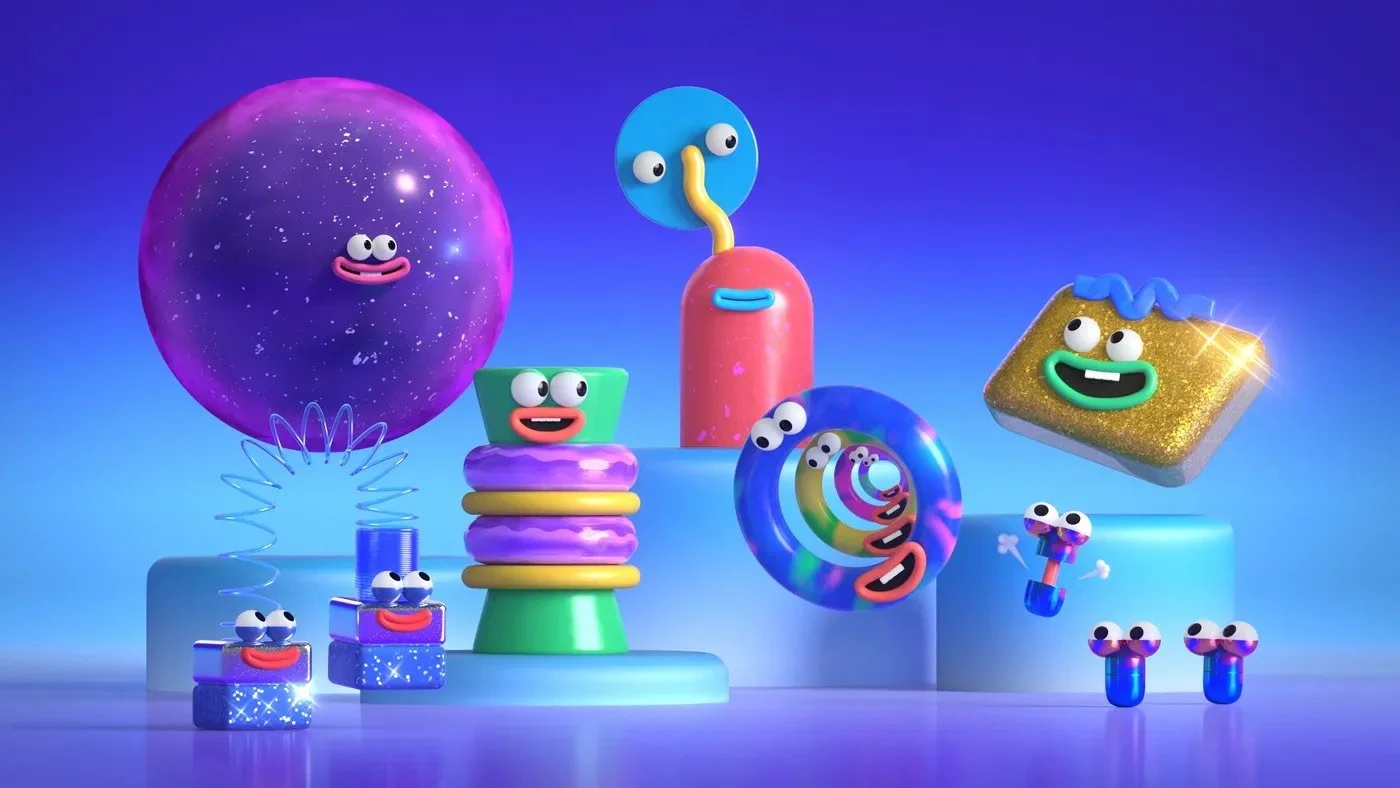
Host Characters & Personalities
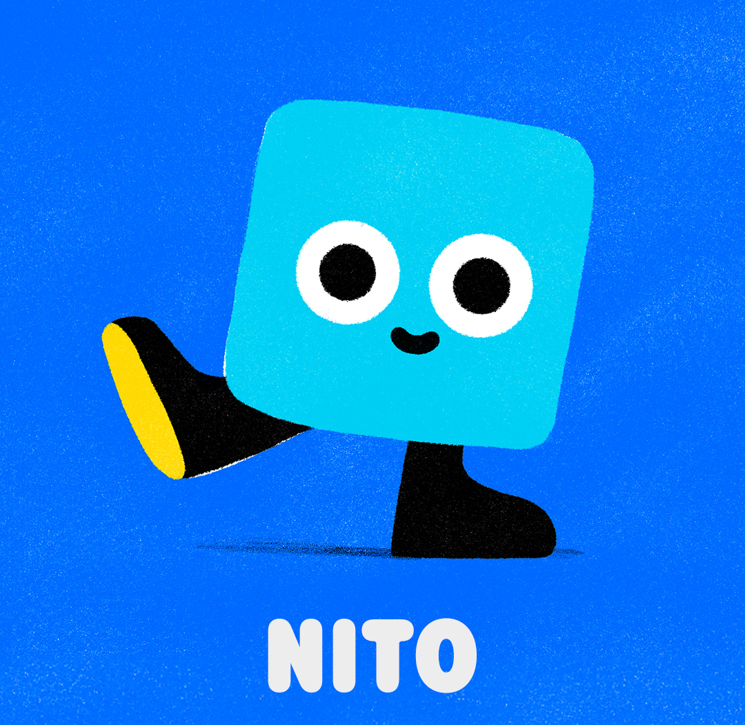
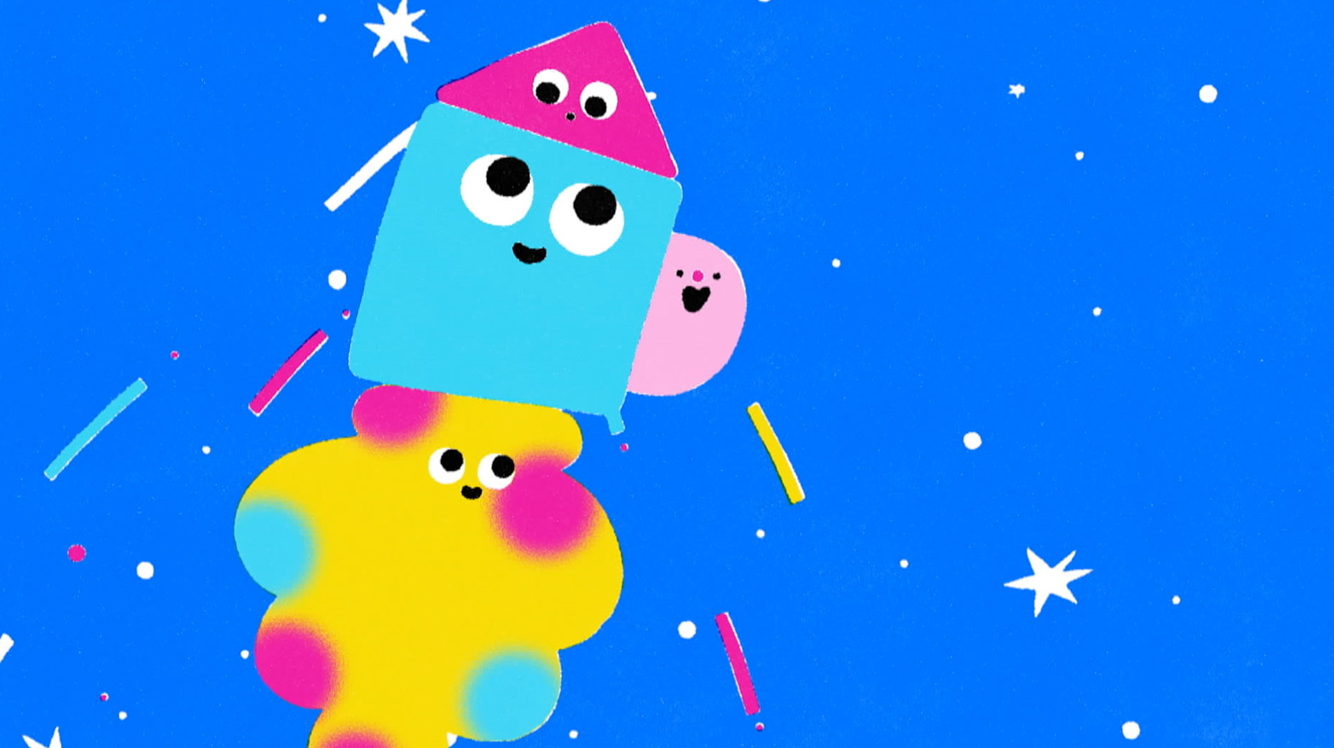
Nito is a joyful, curious box bursting with imagination and surprises. They love exploring and sharing fun facts, and their warm confidence makes them a natural leader and a friend to everyone.
NITO
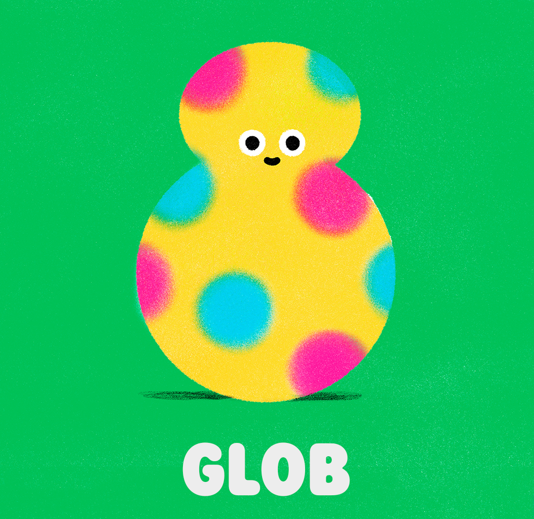
Glob speaks through shapes, not words. A neurodiverse shapeshifter who loves pretend play, they’re caring, protective—especially of Itty—and always saving the day in hilarious fashion.
Glob
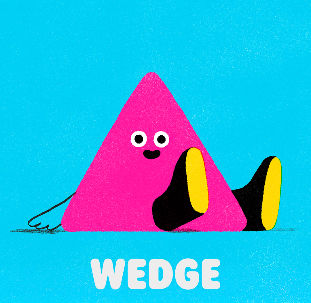
Wedge may start out cautious, but with friends cheering them on, they shine. Trilingual and creative, Wedge loves arts and crafts, helping others, and working as part of a team.
Wedge
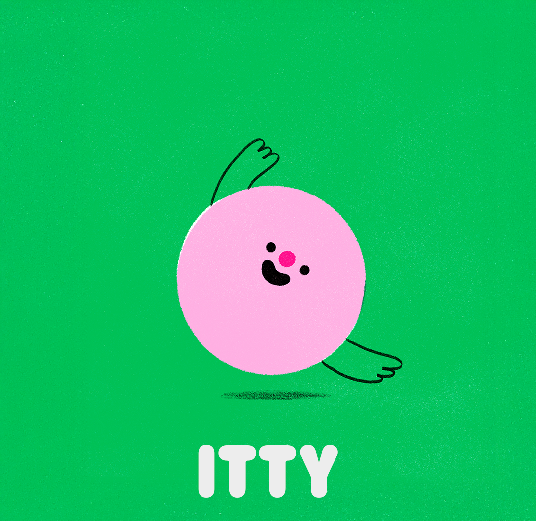
The baby of the group, Itty radiates joyful toddler energy and communicates in giggles, goos, and the occasional upset upchuck.
Itty
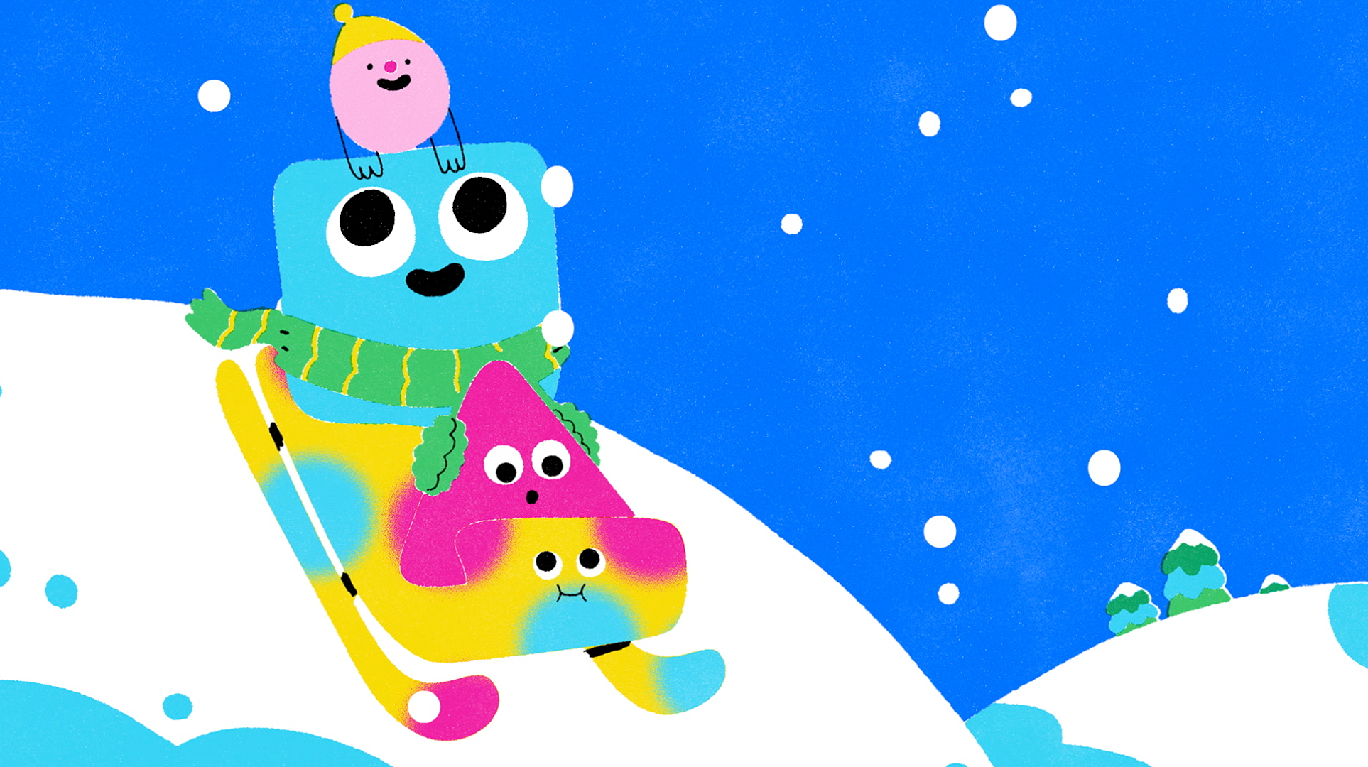
Character Bumpers
The Cartoonito brand system was built from simple, modular shapes, designed to flex across logos, characters, icons, and motion while remaining warm and approachable. Roger Black was chosen for its rounded forms and friendly proportions, subtly referencing Cartoon Network’s typographic DNA while softening it for a preschool audience and holding up clearly in motion and at small sizes.
The Cartoonito logo lettering was custom-drawn to further humanize the mark and ensure it felt native to the system rather than applied. Elements of Cartoon Network’s color palette, geometry, and checkerboard rhythm were woven in to create continuity without direct quotation.
Human-Centric Learning
Visual cues that highlight each show’s developmental focus.
Soft, risograph-textured character bumps brought the Cartoonito hosts to life through simple, toddler-paced, shape-driven storytelling rather than dialogue. The tactile texture was chosen intentionally to contrast with the polished 3D animation and sharp motion graphics common in kids programming, giving the packaging a warmer, more design-forward feel. Characters often became the building blocks of each scene, with Glob transforming as needed to move the moment forward. The refined designs were animated by Giant Ant, developed collaboratively from script through final animation to ensure the tone stayed funny, expressive, and distinct from the shows themselves.
Packaging
Endpages
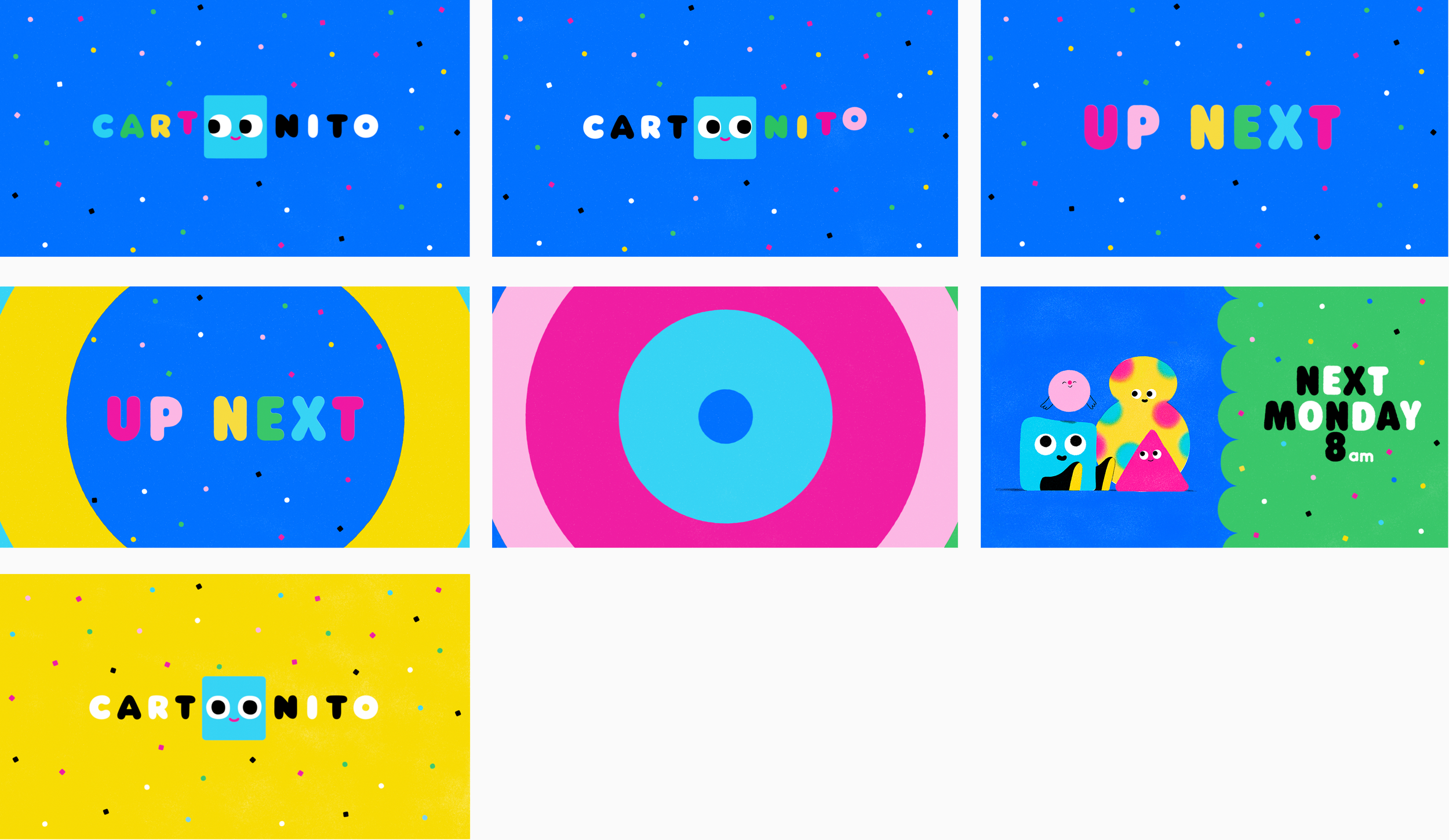
Lower Thirds & Squeeze Credits
A flexible packaging system designed to scale across promos, lower thirds, and interstitials while maintaining a clear visual distinction from programming.
HBO Max Experience
Adapting Cartoonito for HBO Max required working within an existing platform framework while preserving the brand’s warmth and clarity. Rather than redesigning navigation, we retrofitted the Cartoonito system into the established UI, carefully skinning the experience and using bespoke illustration, color, and graphic elements to create a custom feel.
Each surface was treated intentionally, allowing Cartoonito to function as a playful micro-environment within the larger platform while respecting the structure and constraints already in place.
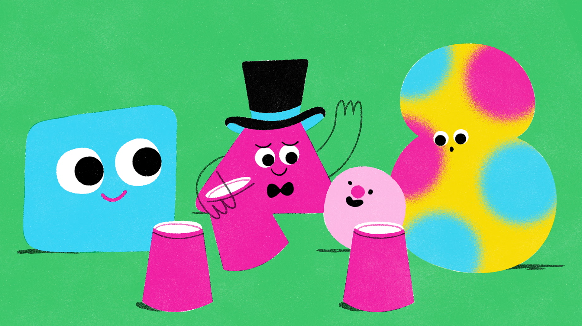
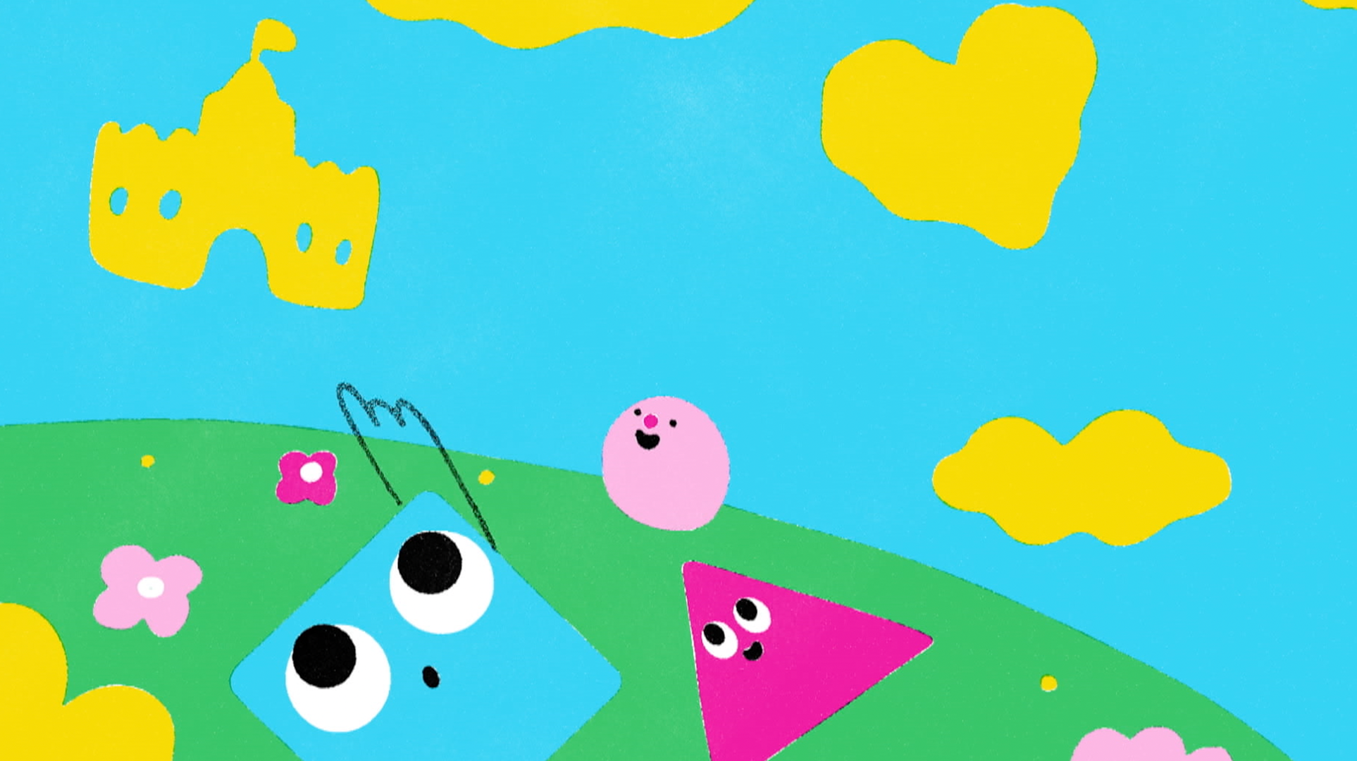
Cartoonito Shorts Program
Expanding the Cartoonito world through bite-sized content
The Cartoonito shorts program was curated to expand the brand through multiple visual voices while maintaining a cohesive system. Working with internal talent and external animation studios, we selected partners and concepts that explored the Cartoonito world in fresh ways while remaining aligned with the brand’s tone and learning principles.
Beepers (BUCK)
A playful assembly of geometric “beeper” characters who learn, build, and move together, with each short teaching resilience, teamwork, and confidence through simple cause-and-effect play.
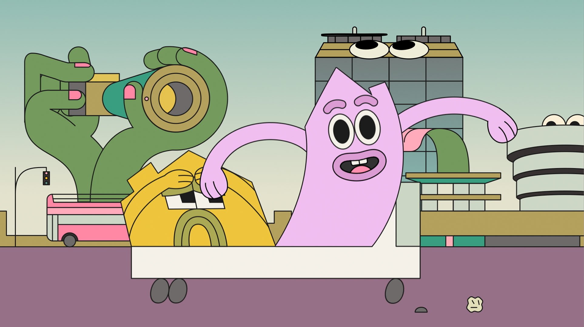
Wide Load Vacay (BUCK)
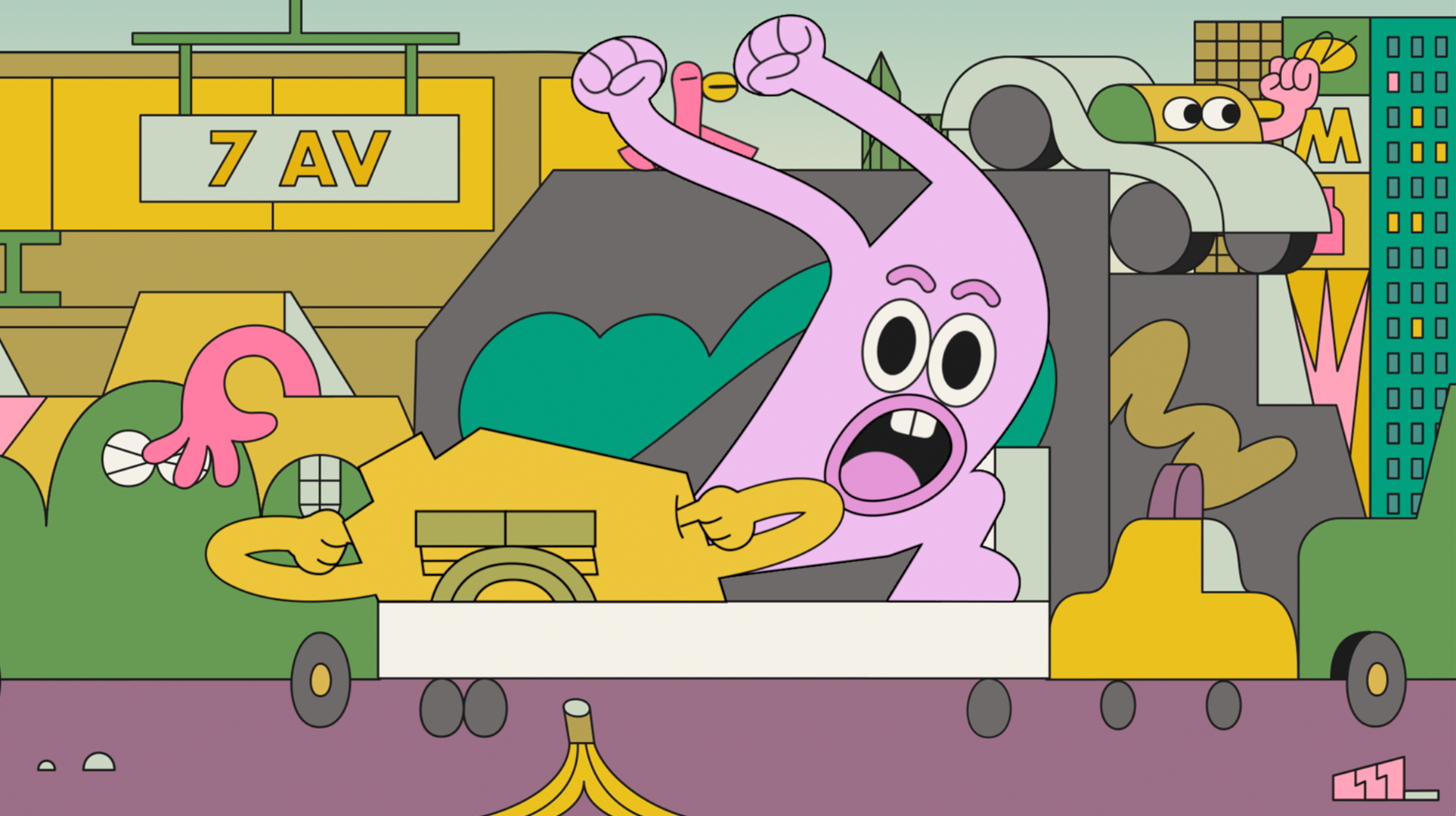
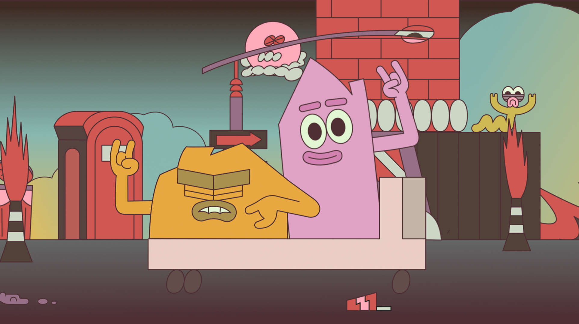
Wide Load Vacay follows two houses on a flatbed truck road-tripping across the country—one anxious and rigid, the other excited and carefree. Each short explores how they see the world differently and learn to coexist, compromise, and support each other along the way.
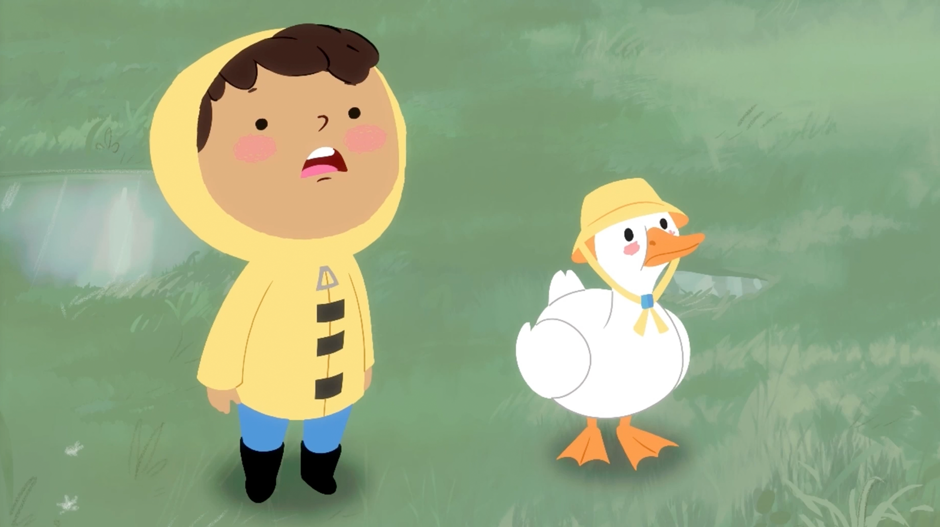
Duck, Duck, Play (Sam Leyja)
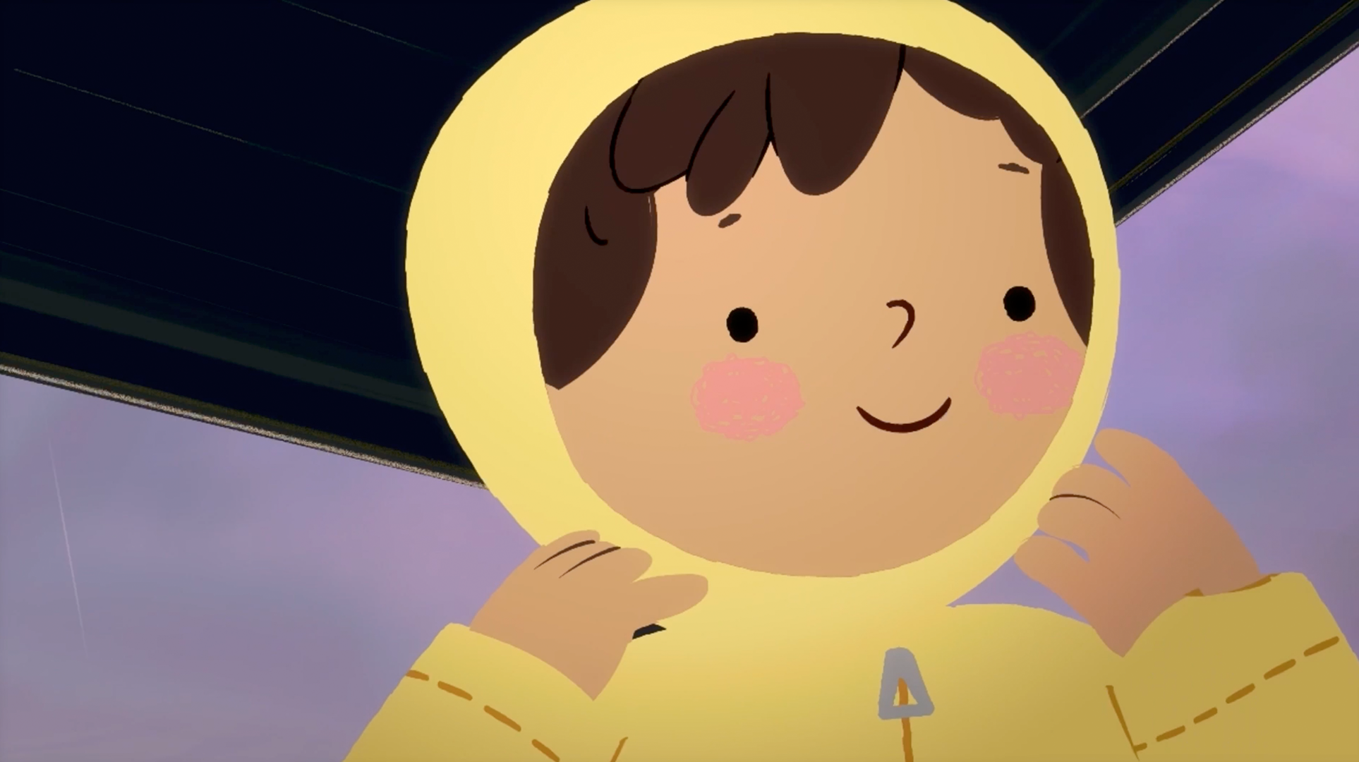
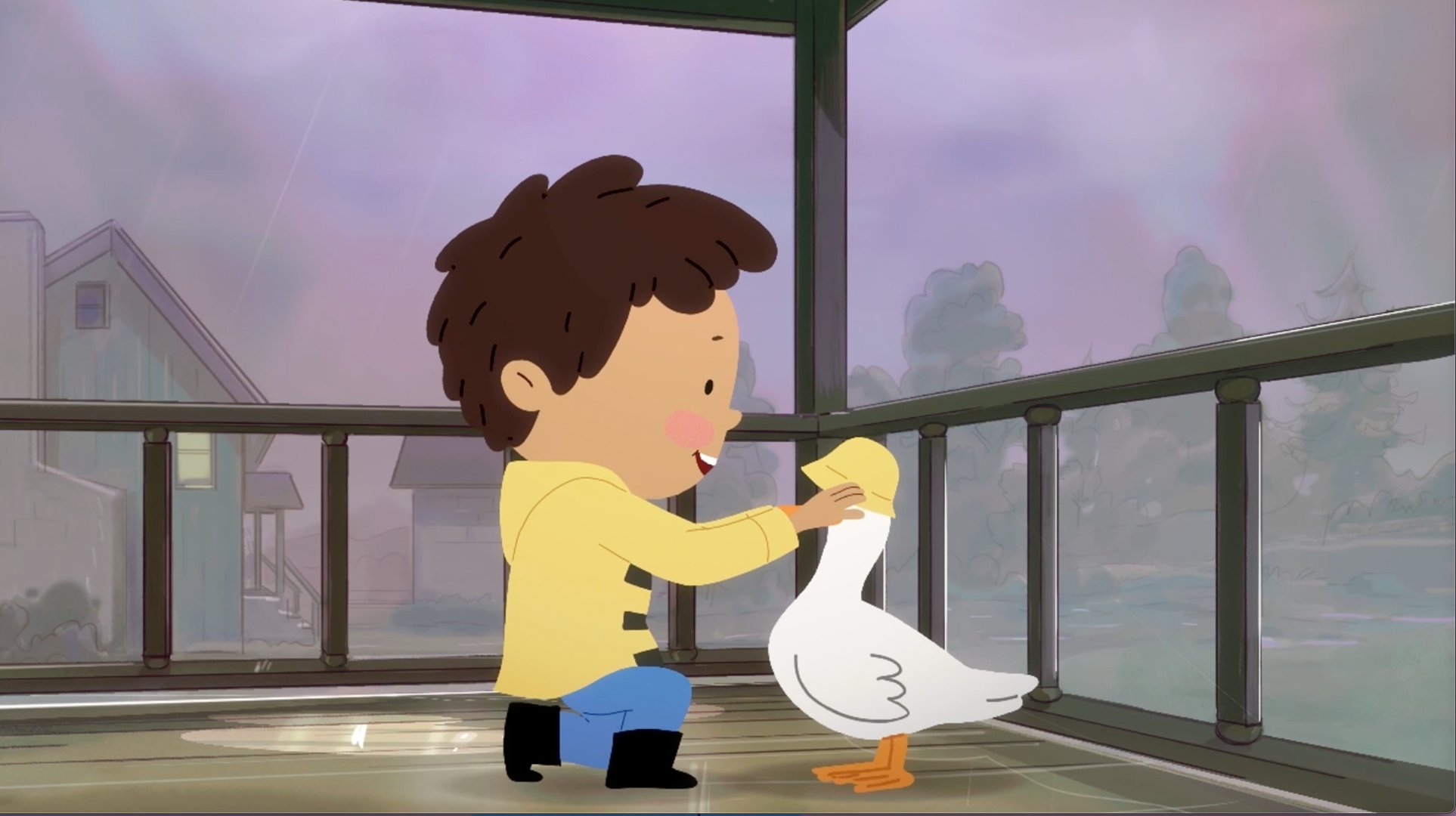
A little boy befriends a duck who helps him see that even when the rain changes his plans, he can still find fun and joy in the moment.
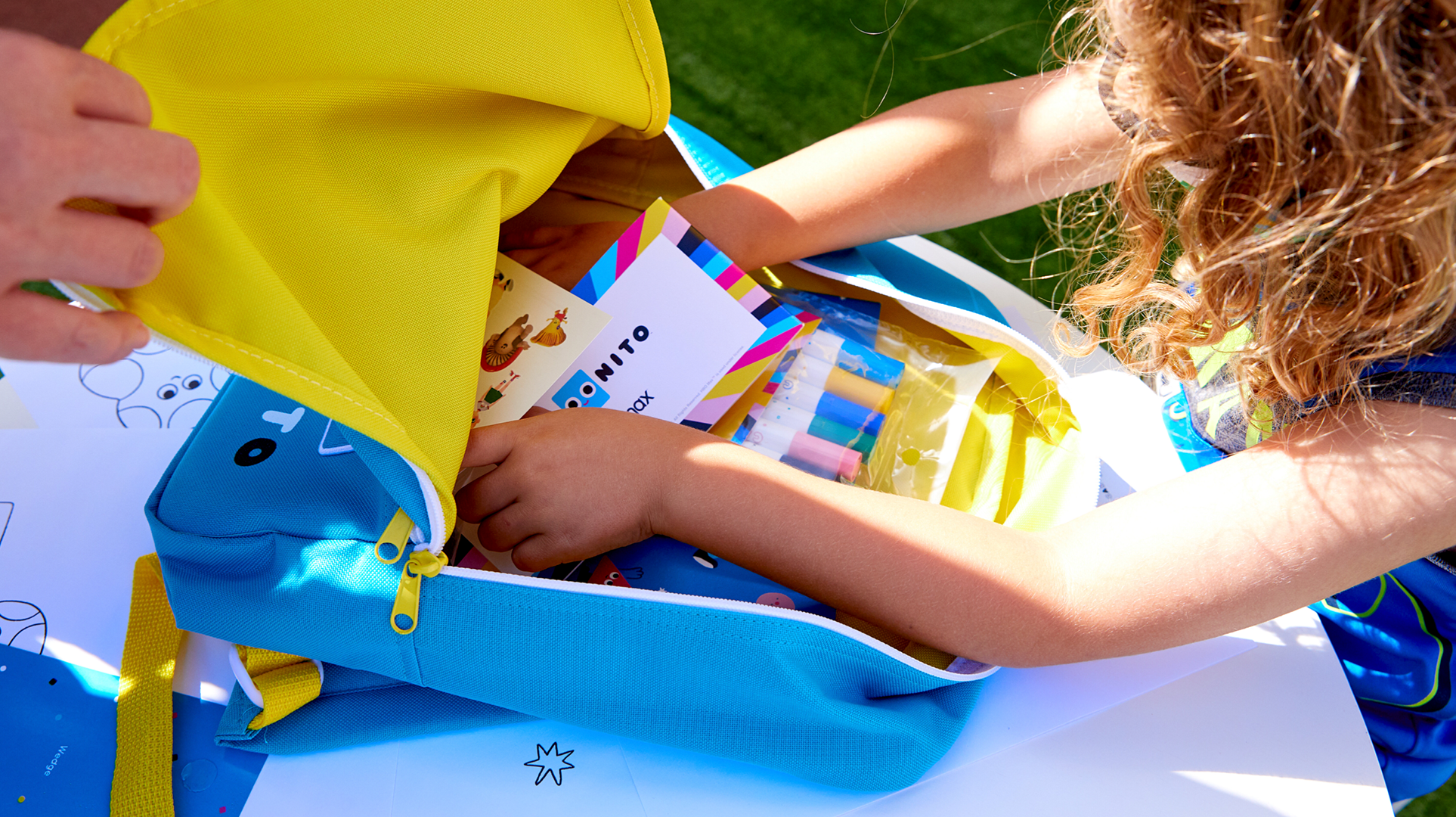
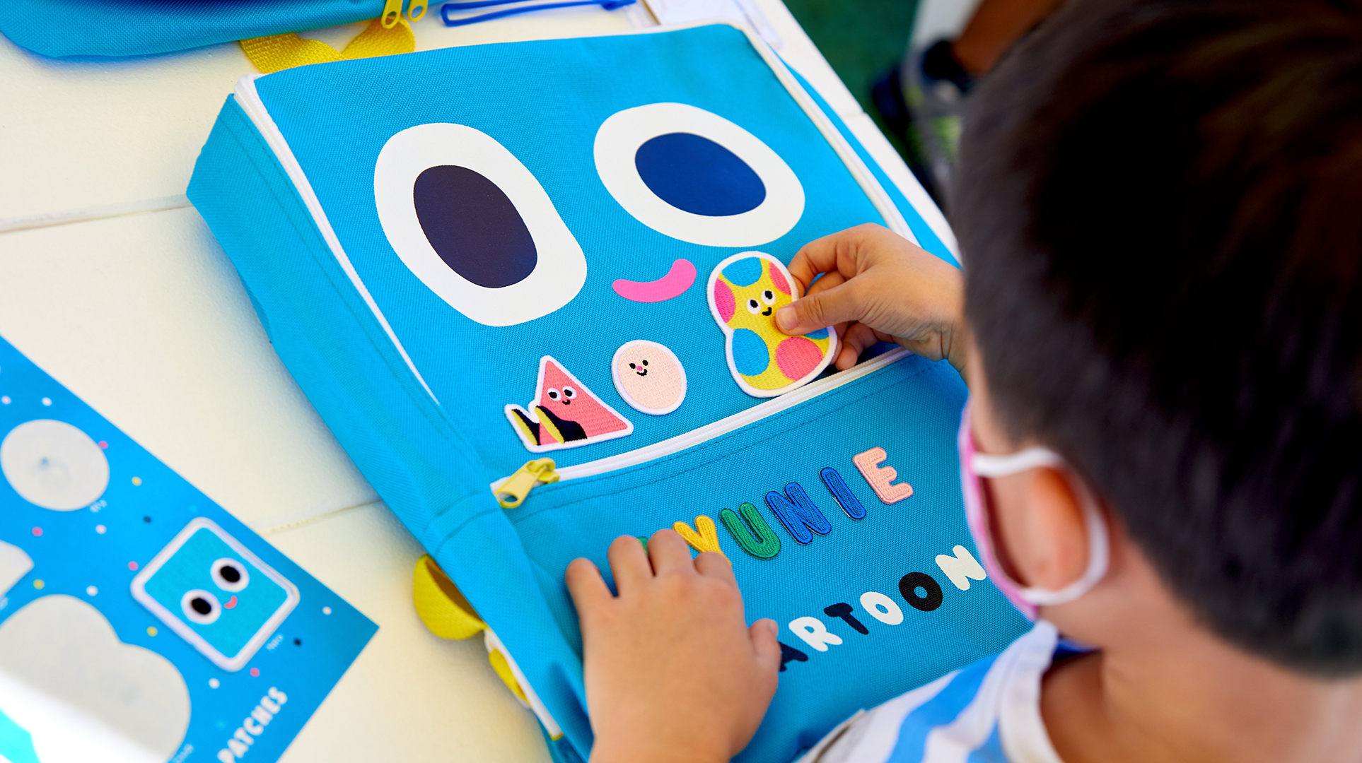
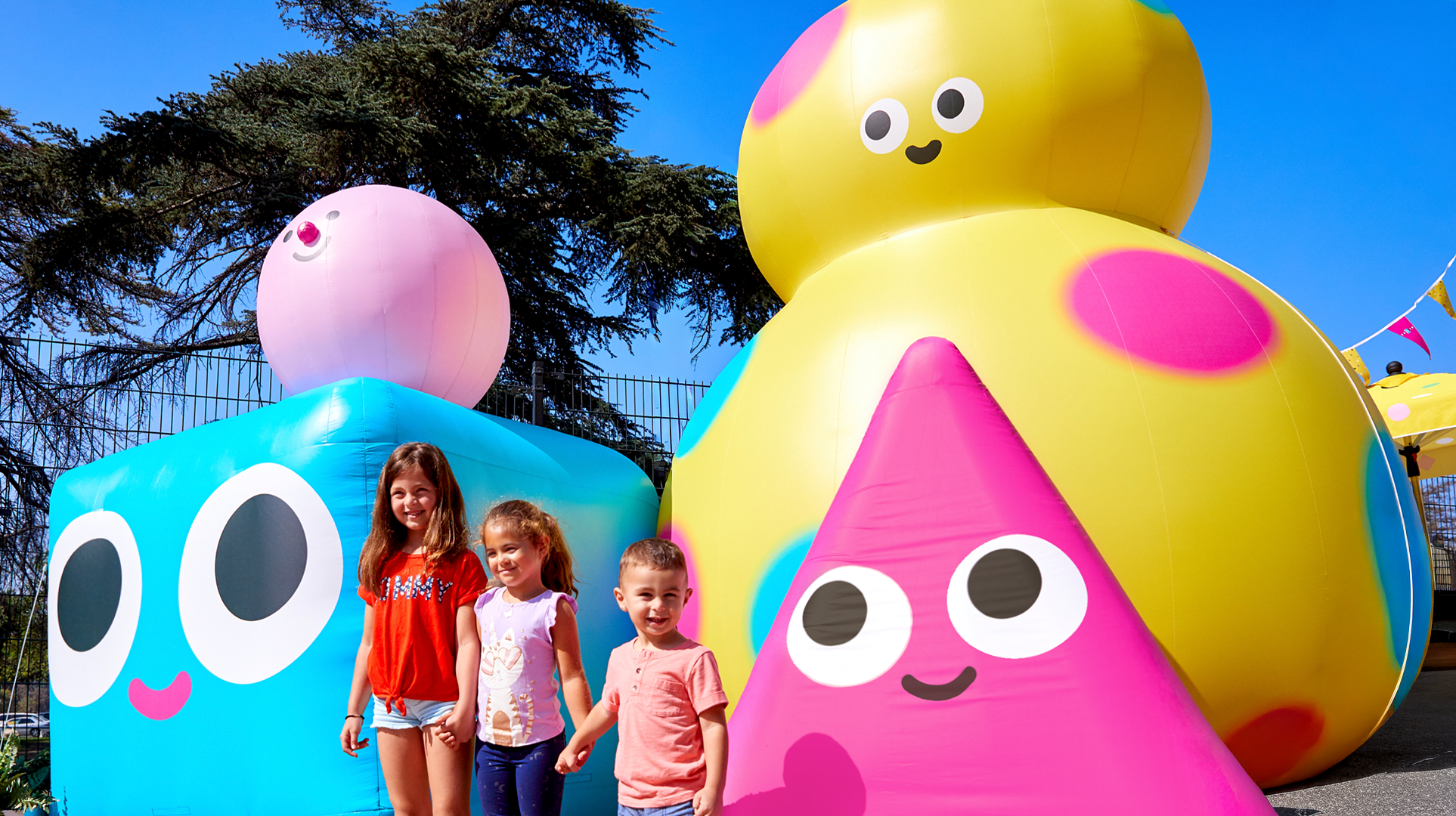
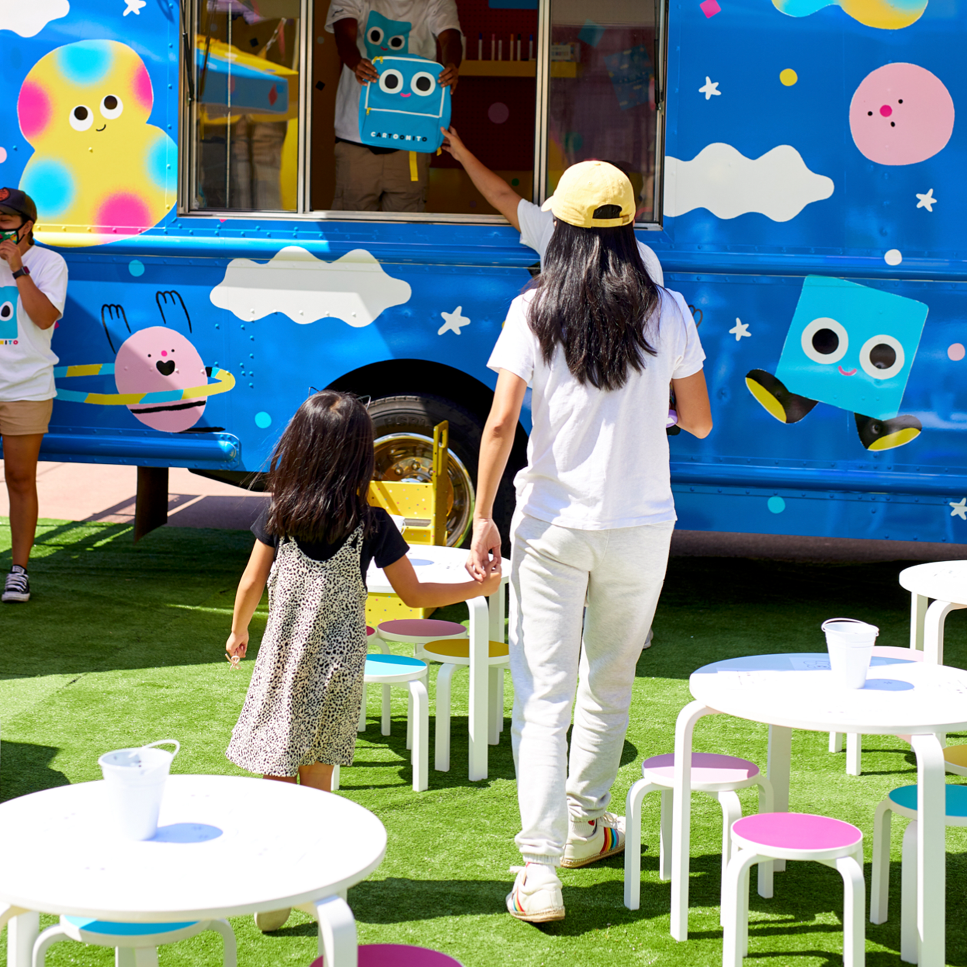
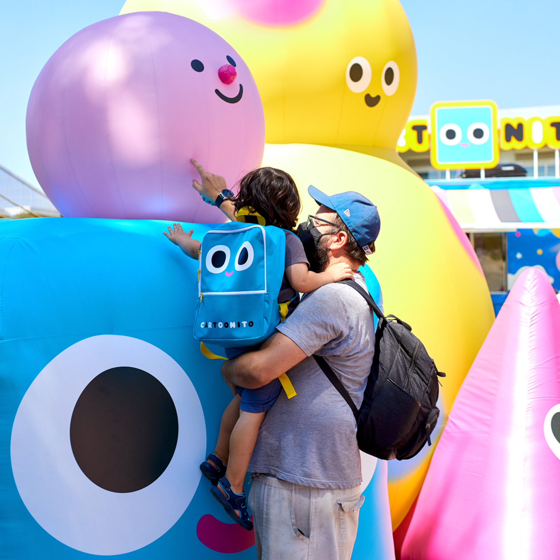
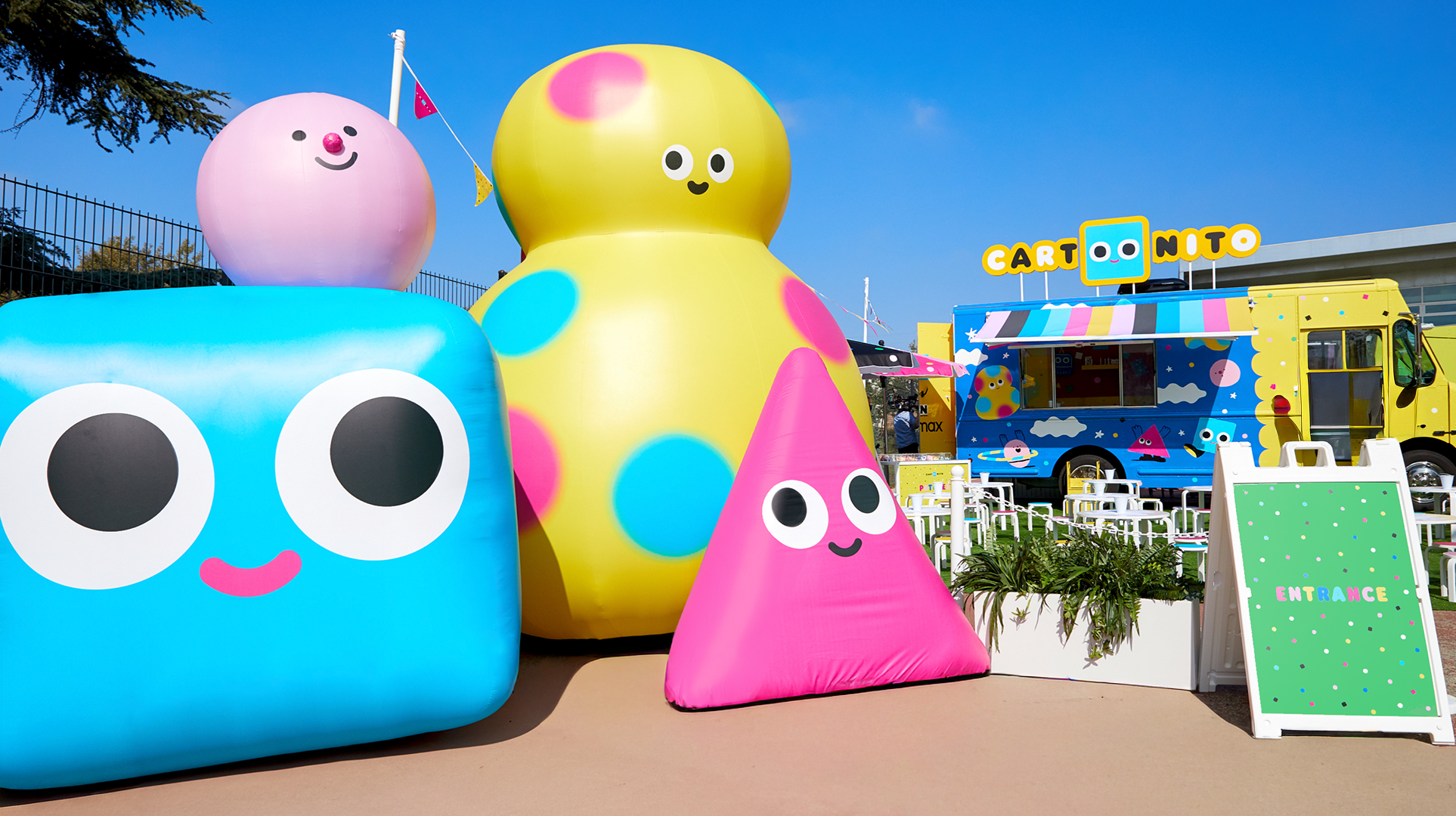
Brand Extensions: Cartoonito Tour
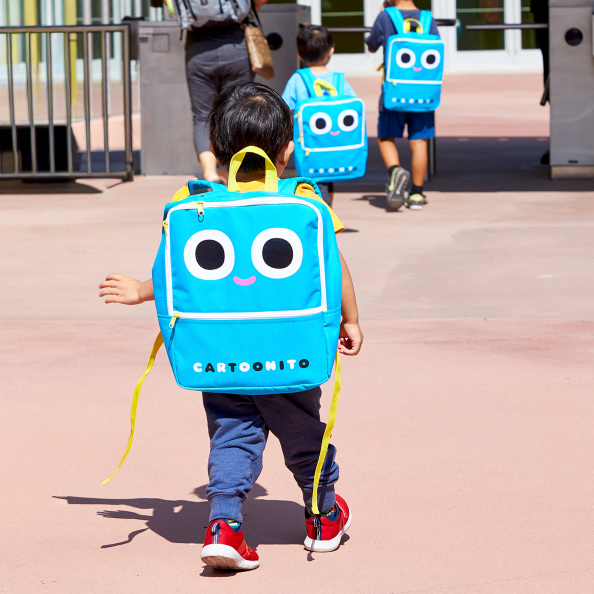
Cartoonito was brought into the real world through a multi-city tour designed to translate the brand into playful, physical experiences. A fully skinned Cartoonito ice-cream truck served as the centerpiece, offering families Nito-inspired backpacks filled with school supplies, character patches, and alphabet patches for custom decorating.
The activation also included Cartoonito coloring books, hands-on activities, and large-scale inflatable characters for photo moments, creating approachable, memorable touchpoints for preschoolers while reinforcing the brand’s warmth and accessibility for parents across multiple cities.
Credits
Network Creative Direction: Candice House
VP, Creative: Jacob Escobedo
Art Director: Petrika Janssen
Internal Teams: Cartoon Network Design & Animation
External Animation Partners: Giant Ant, Buck